Book Ferry
Book Ferry is a service that brings used books to readers across the United States. It encourages readers to expand their horizons, engage with a reading community, and reduce the environmental impact of the new book industry.
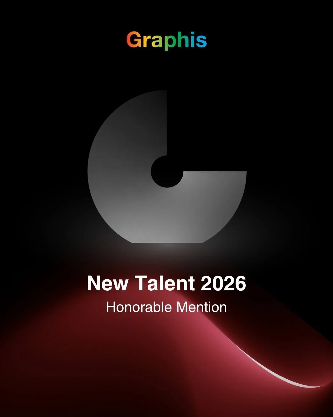
Recipient of the Graphis New Talent 2026 Honorable Mention.
Software
Figma
Adobe Illustrator
Adobe After Effects
Adobe Photoshop
Scope
Branding
UI/UX
Packaging
Motion Design
Website
⊛
Mailer
⊛
Stickers
⊛
Explainer Video
⊛
Website ⊛ Mailer ⊛ Stickers ⊛ Explainer Video ⊛
The Problem
How do we encourage people to read more in a world where digital and social media are increasingly favored?
How can this endeavor stand out from existing book-related initiatives? What core values will drive readers to engage with this product over others?

With the rise of BookTok (the reading-focused niche of TikTok) has come the rise of a sort of “fast-fashion” of books. Titles are churned out based on popular tropes and perceived hype rather than crafting a thoughtful story.
The price of physical books can be a barrier to entry, with even paperbacks averaging in the mid teens–twenties. What if you don’t even end up liking the book?
It can be hard to find the motivation to read consistently, but there’s satisfaction to knowing someone loves a book as much as you.
The Strategy

Research Objectives
Build a background on the book industry within the U.S.
Explore the historical and contemporary landscape for existing pain points.
Connect with readers and non-readers alike to tailor the service to current habits.
Research Methods

Conducted online research on various blogs, news sites, and Mintel. Developed a background in the life cycle of books, publishing, and reading habits.

Looked at existing and past initiatives online: BookMooch, Little Free Library, Book of the Month, and various book clubs. They provide good modern and historical context for what works and what doesn’t.

Conducted a small survey with 50 respondents to get more subjective reading data.

Interviewed Rebecca Budinger-Mulhearn, Head of Circulation at RIT Libraries. She provided great conversation and a good sounding board to discuss my idea as it came more into focus.
Key Takeaways

30 Million
trees are cut down annually to produce books in the US.

of books in bookstores are remaindered.
Sent back to the publisher or to a wholesaler/re-lister where they may be resold, recycled, pulped, donated, or destroyed.
30%

$114
spent per household annually on books (on average).

74%
of survey respondents said they would be more likely to read a book if it was recommended by friends or family.
Driving Values
Based on research findings & consumer need.
Diversify content consumed amongst readers.
Foster community and conversation centered around books.
Prioritize sustainability across all operations.
Audience
Readers based in America, ages 16+. Avid readers or those looking to read more but don’t know where to start.
Community-oriented and looking to venture beyond popular book recommendations, and/or to read from more diverse authors and perspectives.
The Solution
How Book Ferry shows up in the world.
High impact & intentionality.
Branding Process
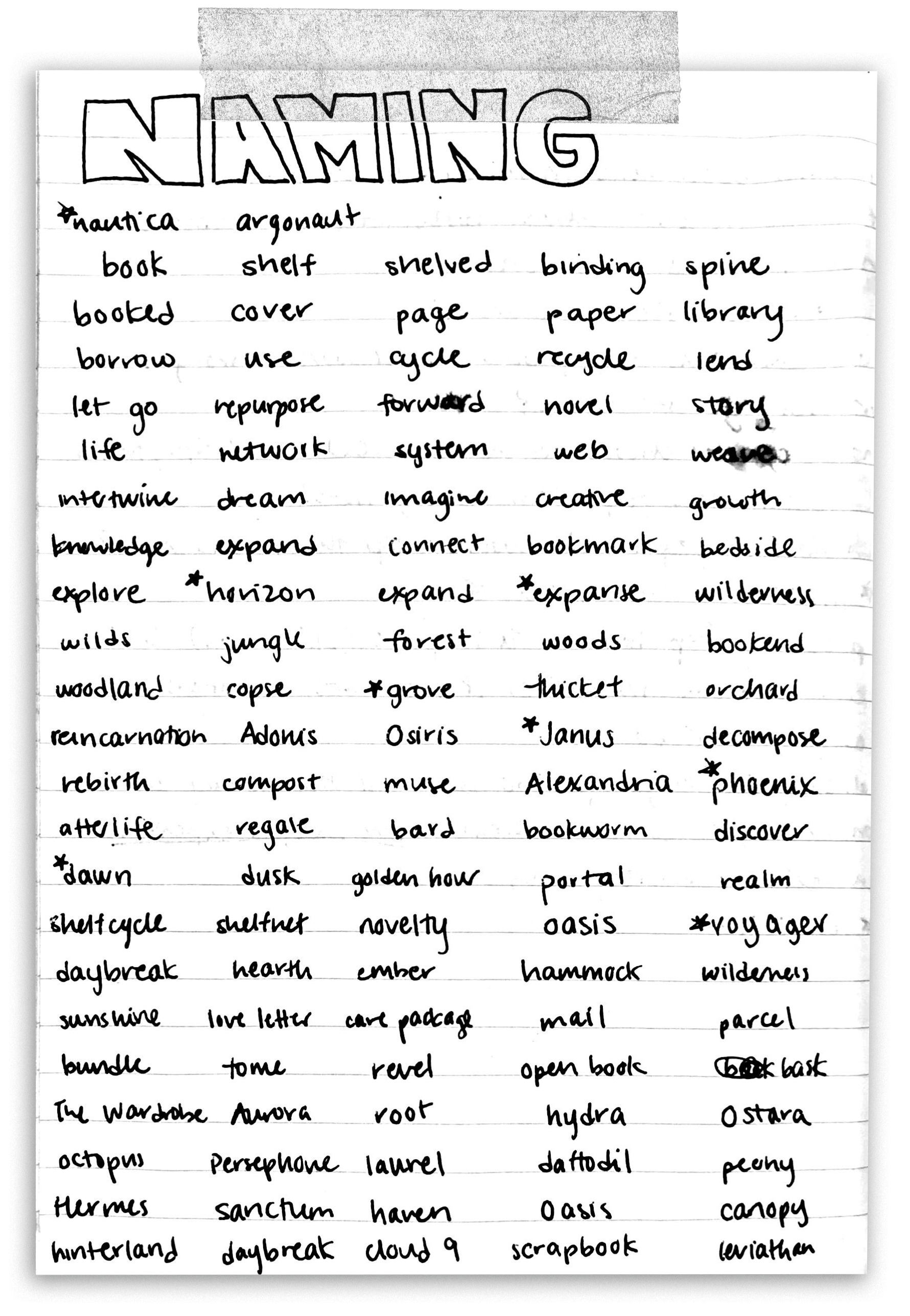
Naming the Service
I explored a wide range of options that spoke to exploration, growth, nature, sanctuaries, and so on.
Why “Book Ferry?”
Sounds like “Book Fairy” — delivering the gift of your books
Idea of exploration and travel
Creates a strong theme to play off of for branding and assets
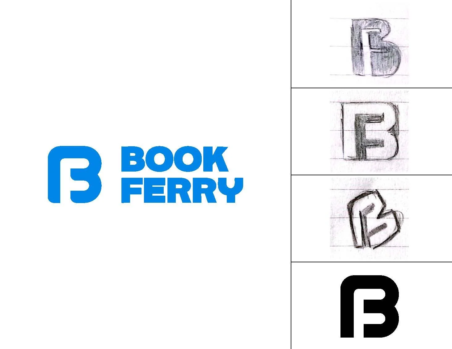
Concept: Combination of B & F. Simple, friendly, and approachable.
Reason for Rejection: Felt slightly too childlike. No real insight into the service from the mark alone.
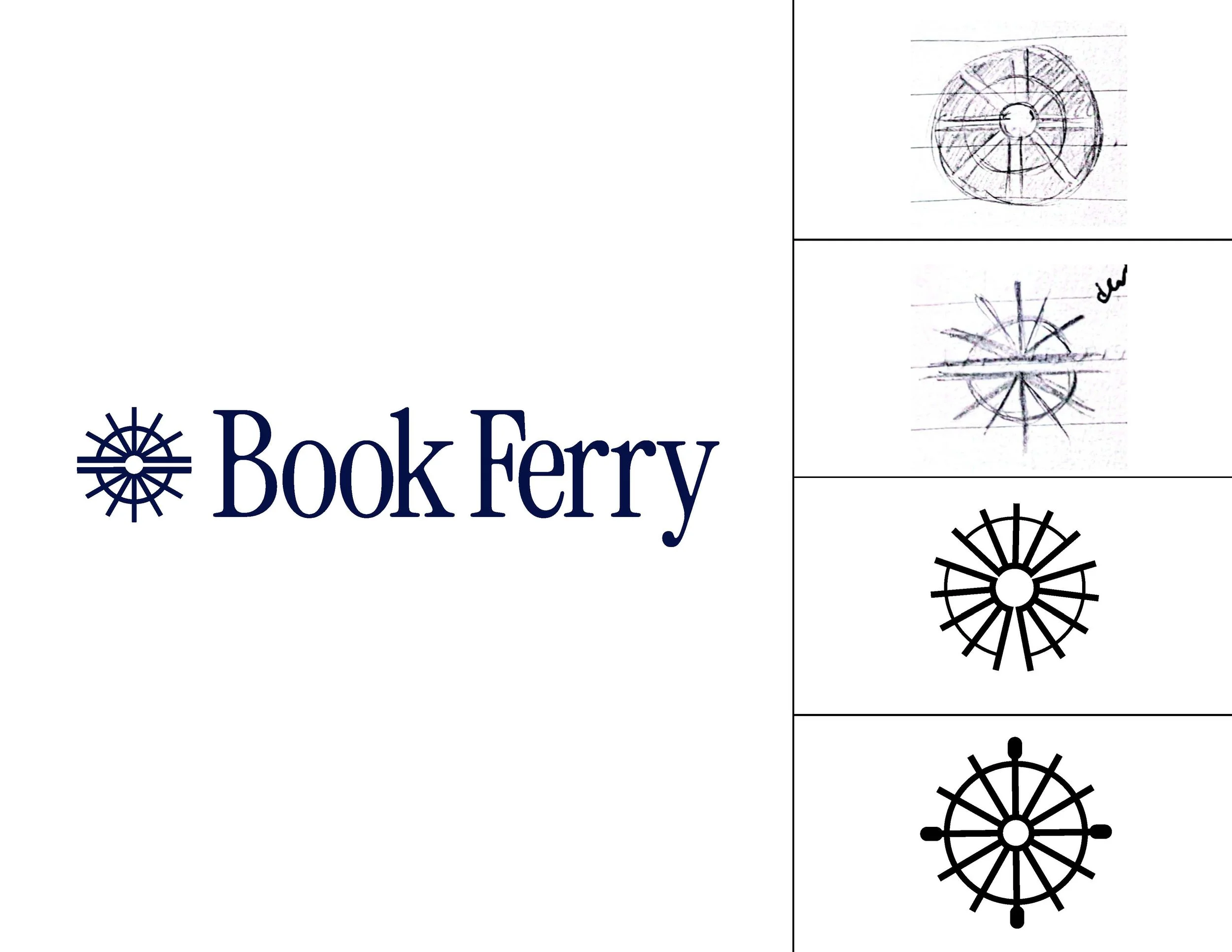
Concept: Combination of water wheel and open book. Clean & refined.
Reason for Rejection: Hard to discern at small sizes. May be confusing or too similar to AI logos.
Final Direction
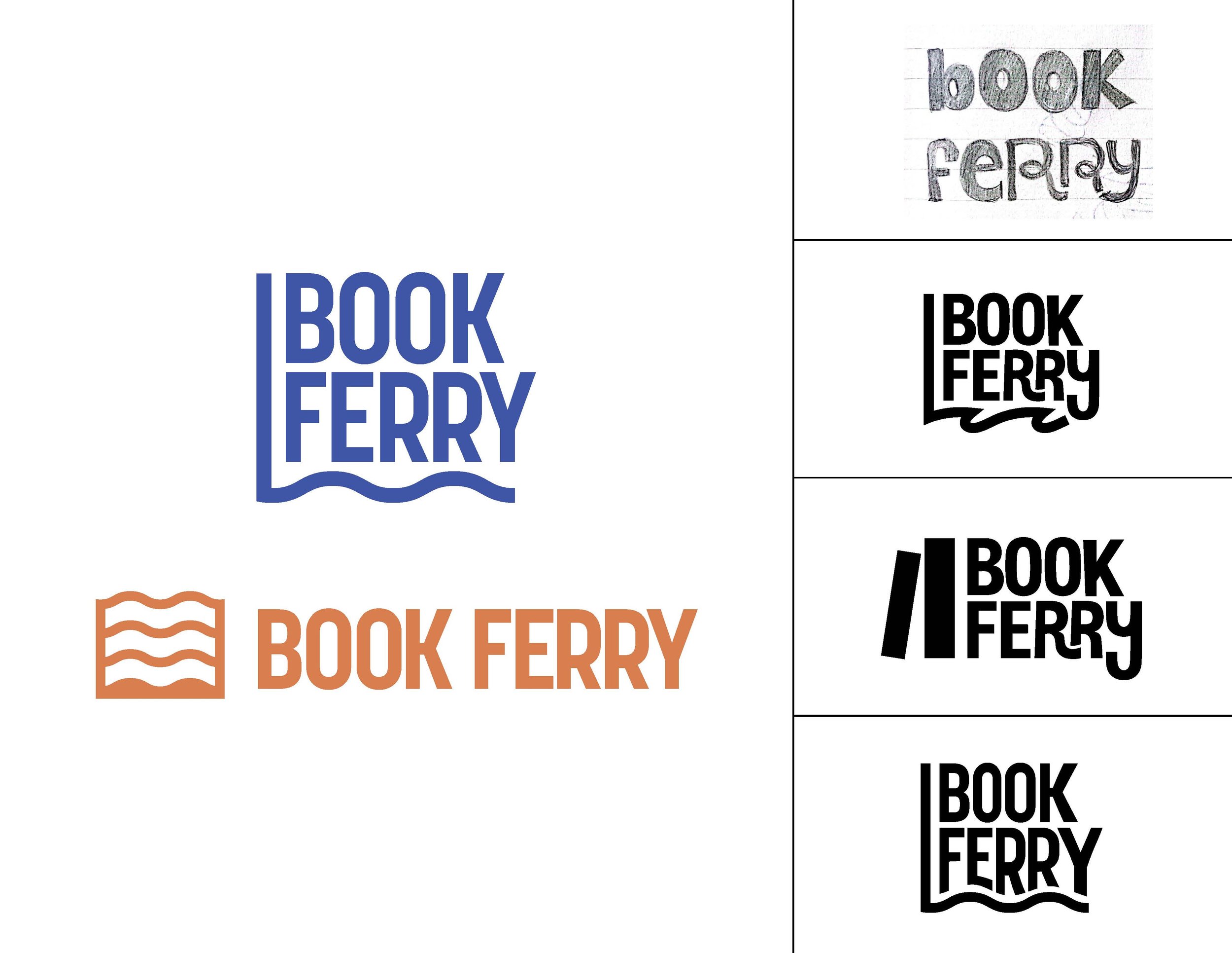
Concept: Bookend combined with wave imagery. Simple, clean, playful, with some movement.
Reason for Selection: Approachable and alludes to each part of the service’s name. Allows for the word mark to be neatly squared up in a vertical logo or exist separately from the logo mark in a horizontal lockup.
Moodboard
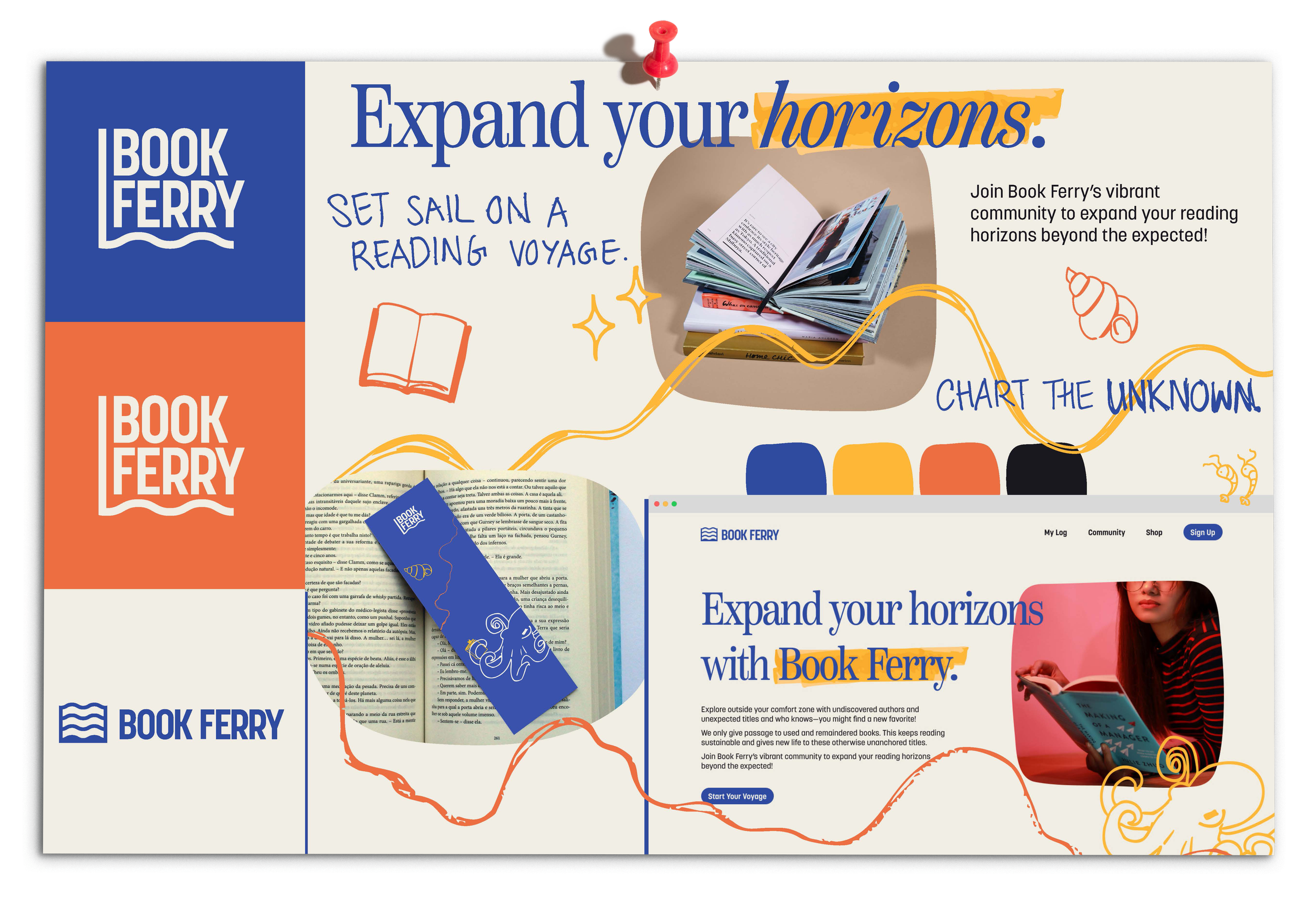
Exploring how type, color, illustrations, and voice would all show up across Book Ferry’s platform. Highlights and hand-drawn elements mimic hand-written annotations and doodles, adding textural elements and visual interest.
Final Branding
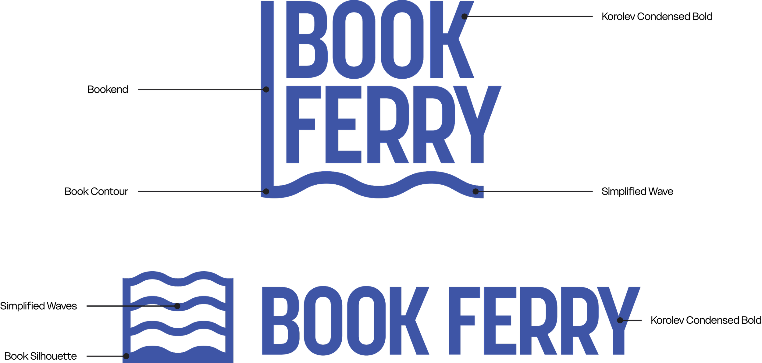

A distinctive, condensed serif that conveys intellectuality while still being friendly and approachable. A contemporary take on old-style serifs.

A grotesque sans serif designed both for print and online, just like Book Ferry. Its inspiration from late 19th century American typefaces meshes well with Instrument’s old-style look and feel.
Coral
#ED6E41
0 54 73 7
Ocean
#2D4AA0
72 54 0 37
White
#F3EFEC
0 2 3 5
Sunshine
#FEB737
0 28 78 0
Black
#18171E
20 23 0 88
Blue as the primary color—ocean, waves; blue is often associated with trust & intelligence.
Orange and yellow as strong contrasting colors—coral, sand, sunshine.
Packaging Process
The Animals
With the nautical theme locked into place, I knew I wanted to use sea creatures throughout as visual elements and texture, and to add personality.
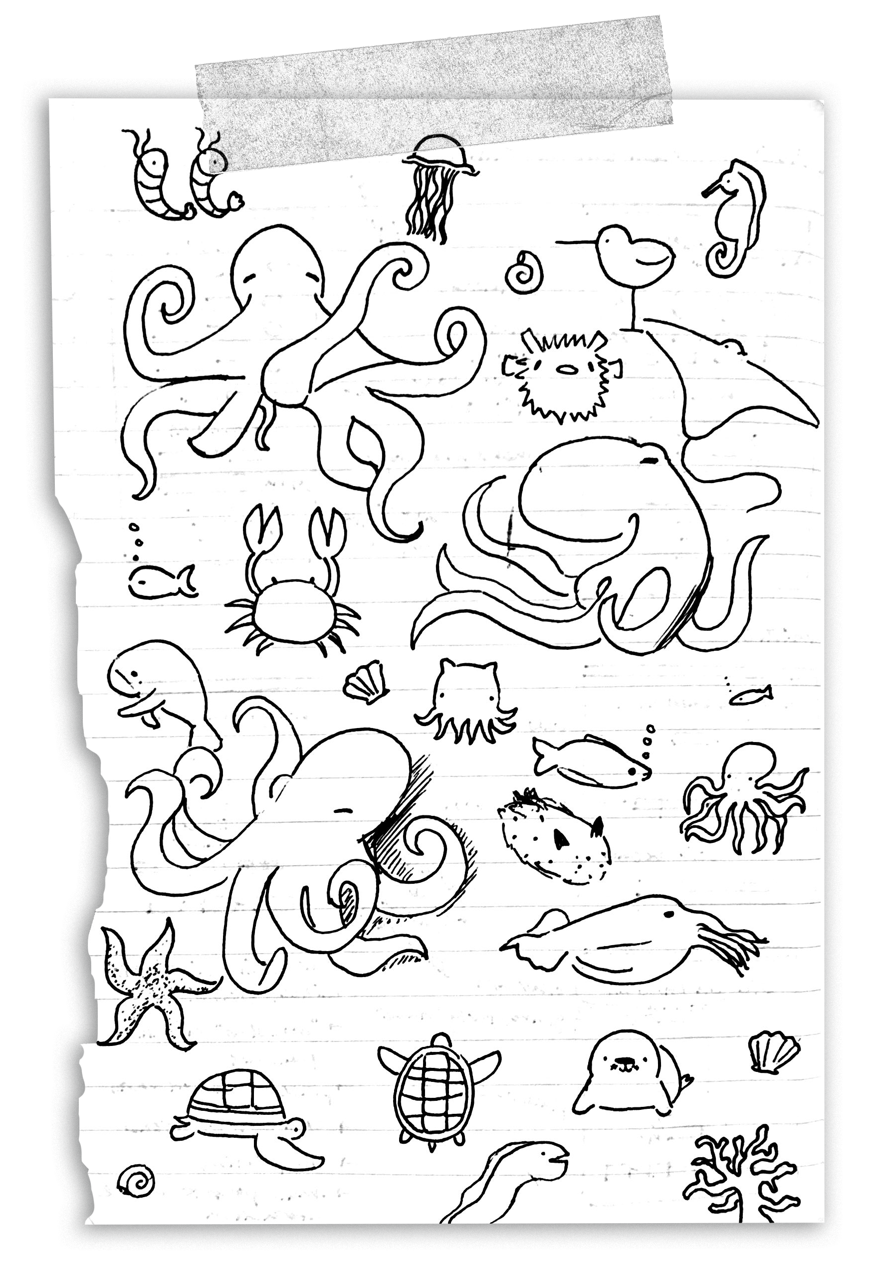
It Starts with a Sketch
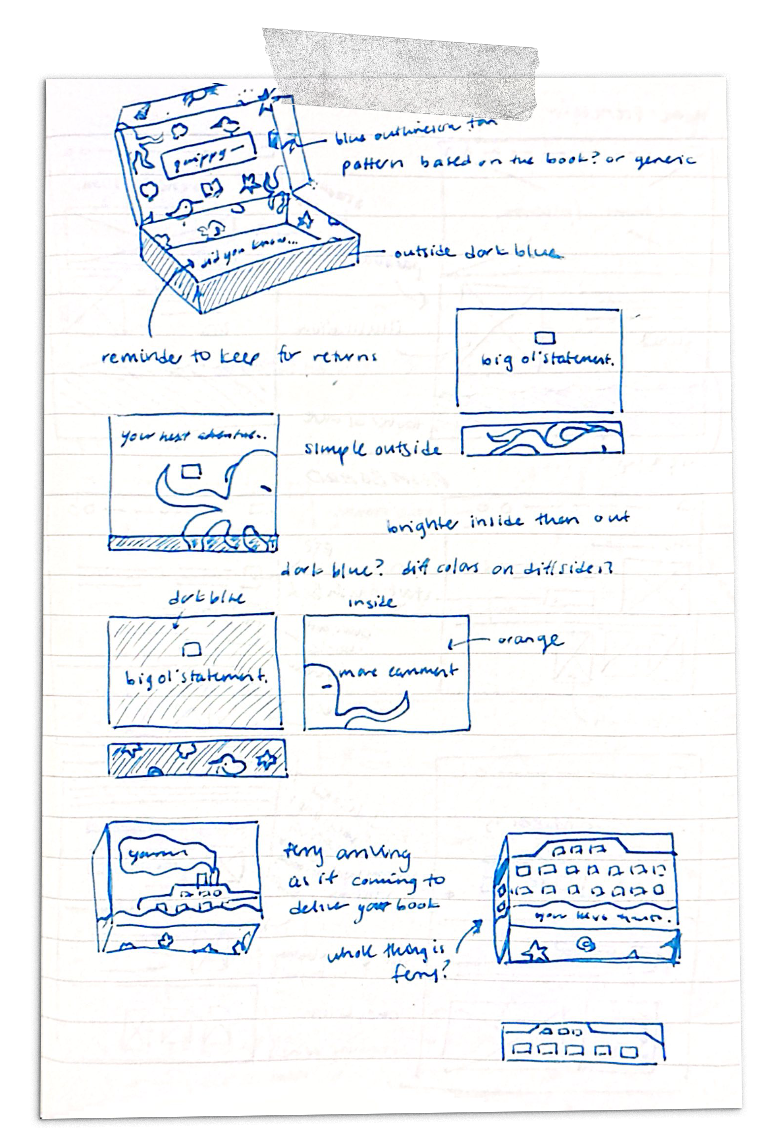
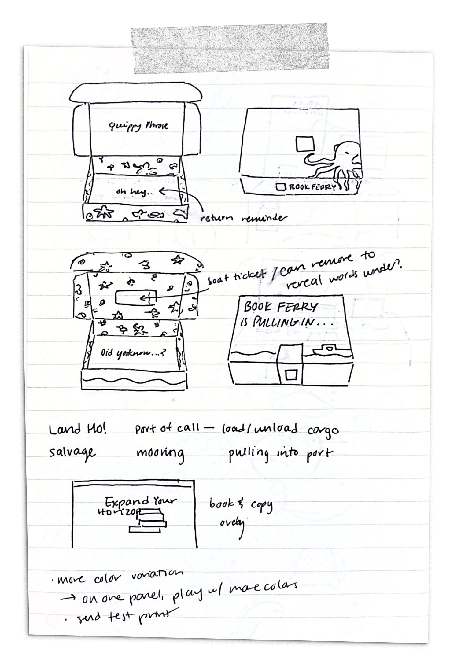
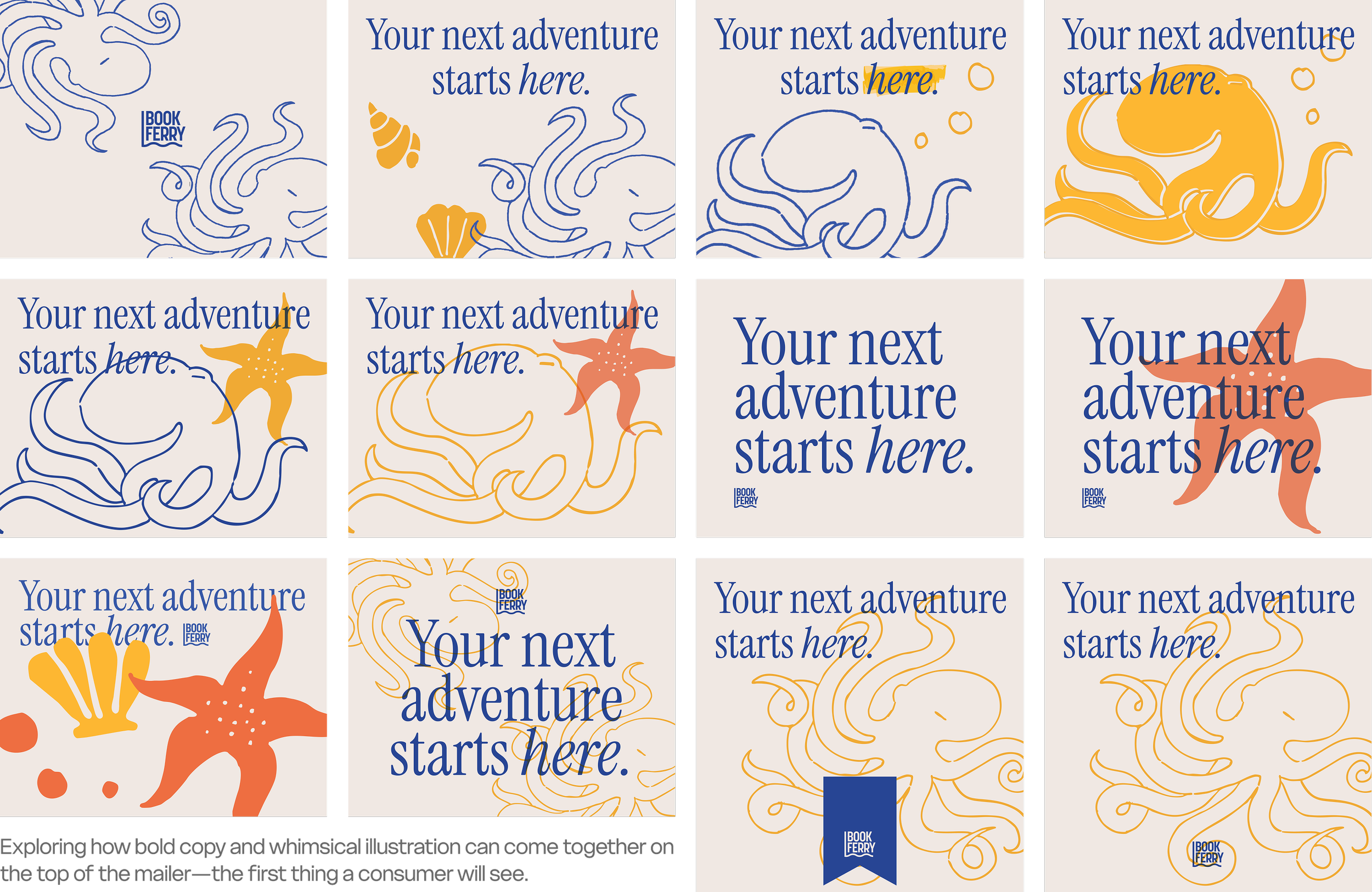
I then moved on to sketching the box and possible layouts with copy. I prioritized impactful, punchy copy paired with both a pattern and macro illustrations.
Final Packaging
Dielines
Left: External print. Right: Internal print.
Top: External print. Bottom: Internal print.

Using boxup.com, I was able to check my dielines and get a printed proof to ensure seamless patterns, continuous designs, and proper sizing.
The Final Box
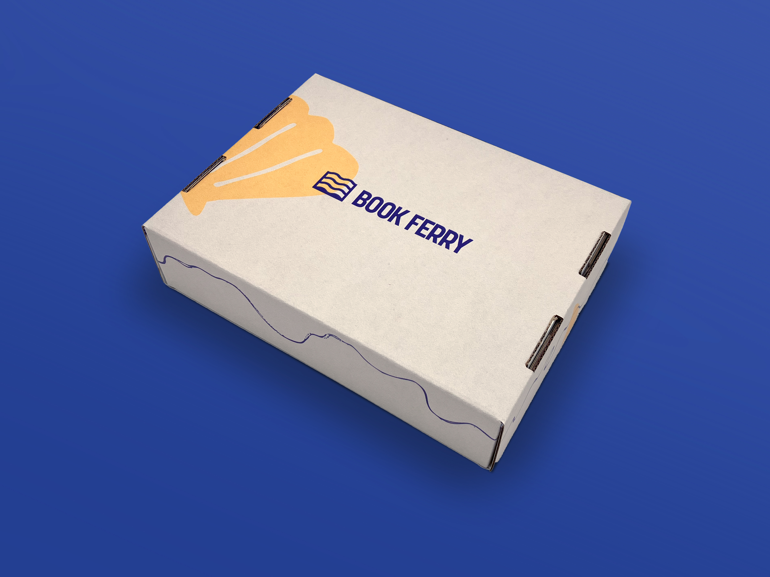
Final printed box, photographed then retouched in Photoshop.
A muted, off-white exterior opens to a vibrant interior, creating a sense of excitement. The “Welcome aboard” bounding box resembles a ferry ticket, and the bubbles from the octopus resemble a thought bubble.
The bottom of the box, once the book is retrieved, encourages readers to return their book using the same packaging.
Web Design Process
The Site Map
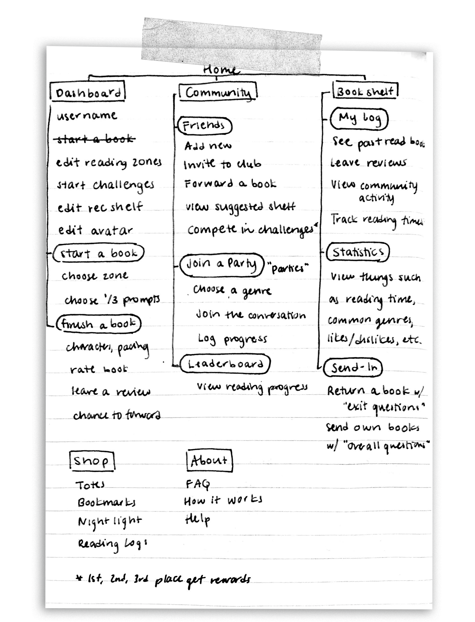
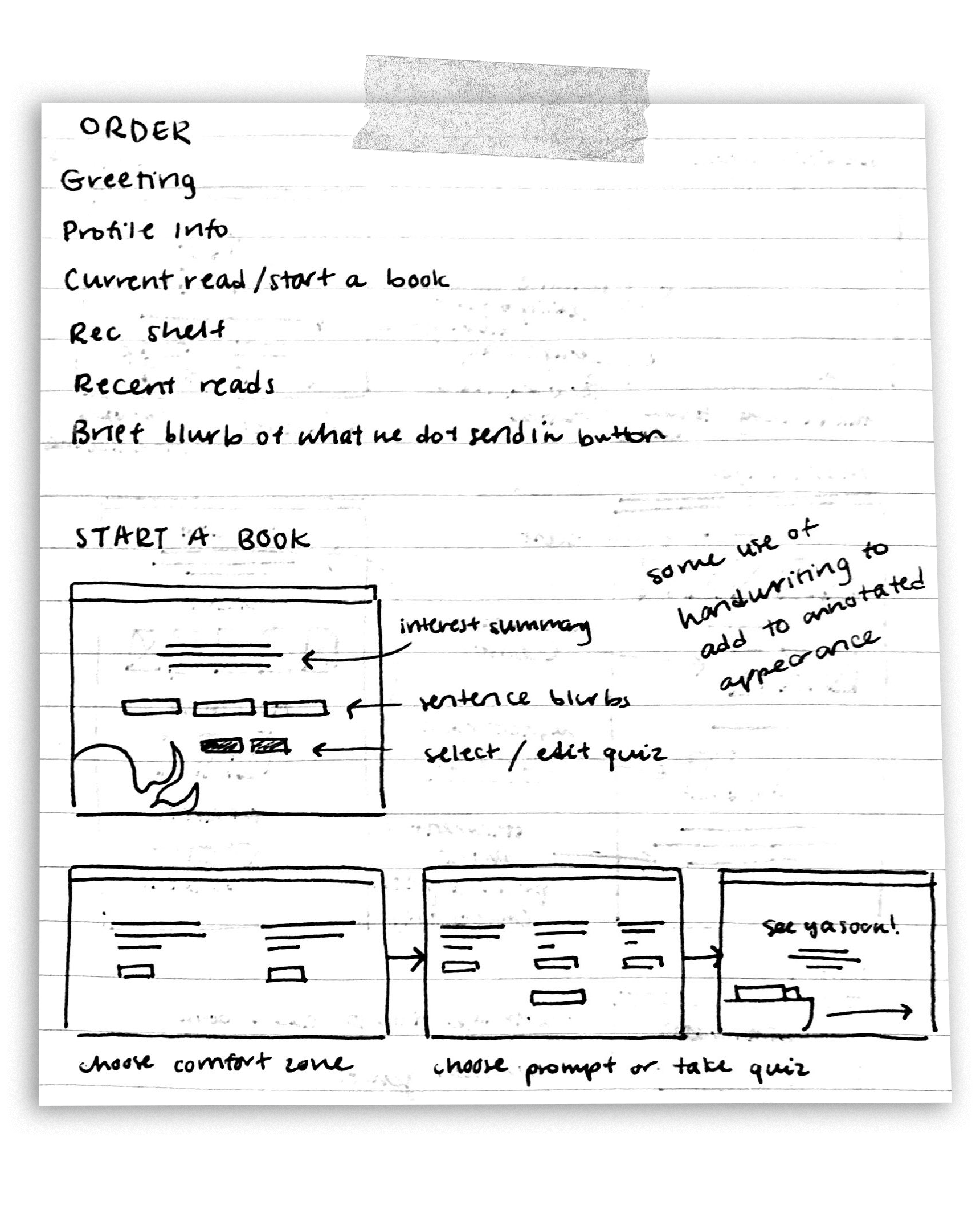
After careful deliberation and senseless scrawling about what core tenants I wanted to include on the site, I created a site map to more carefully lay out the plan.
Wireframes
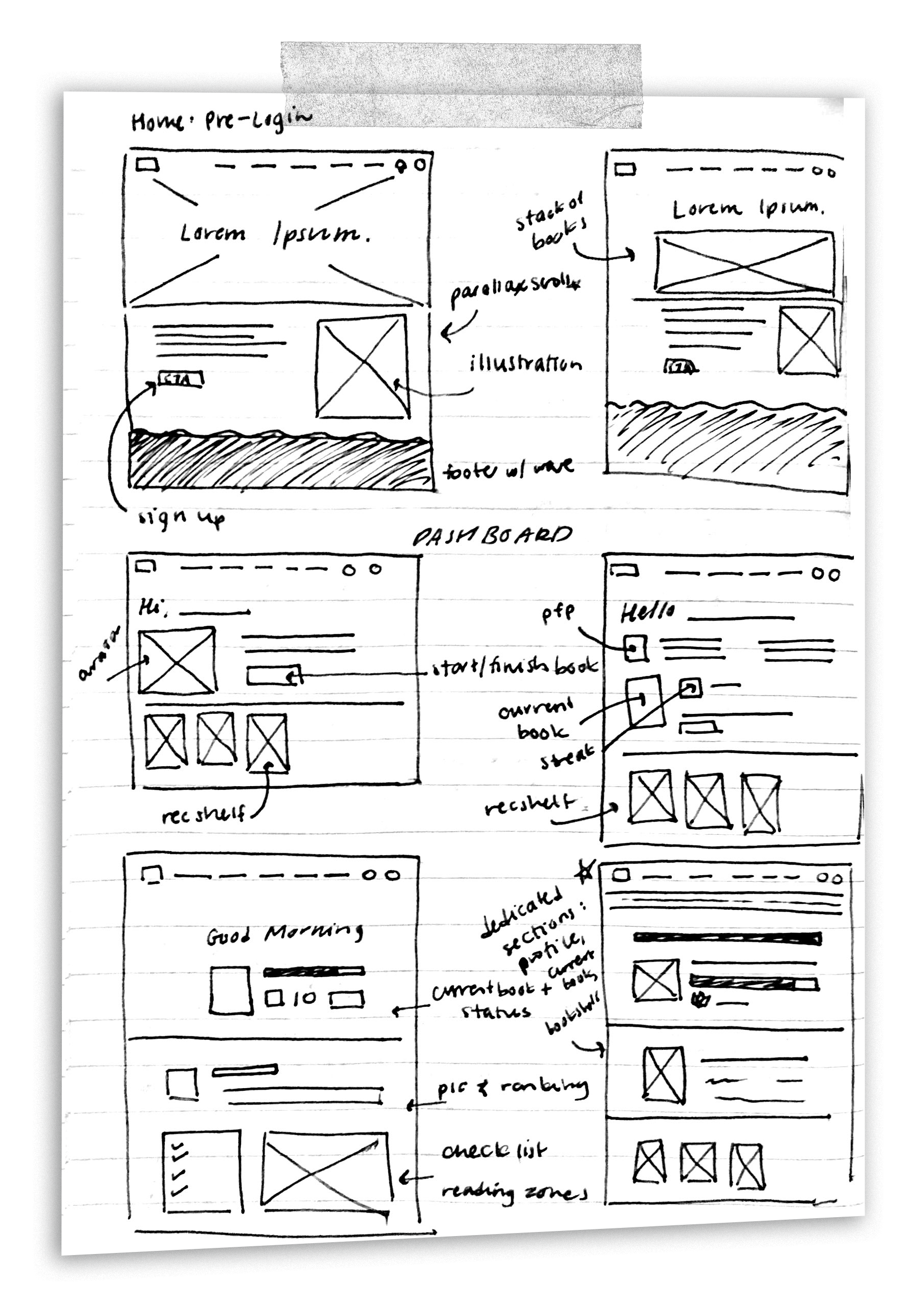
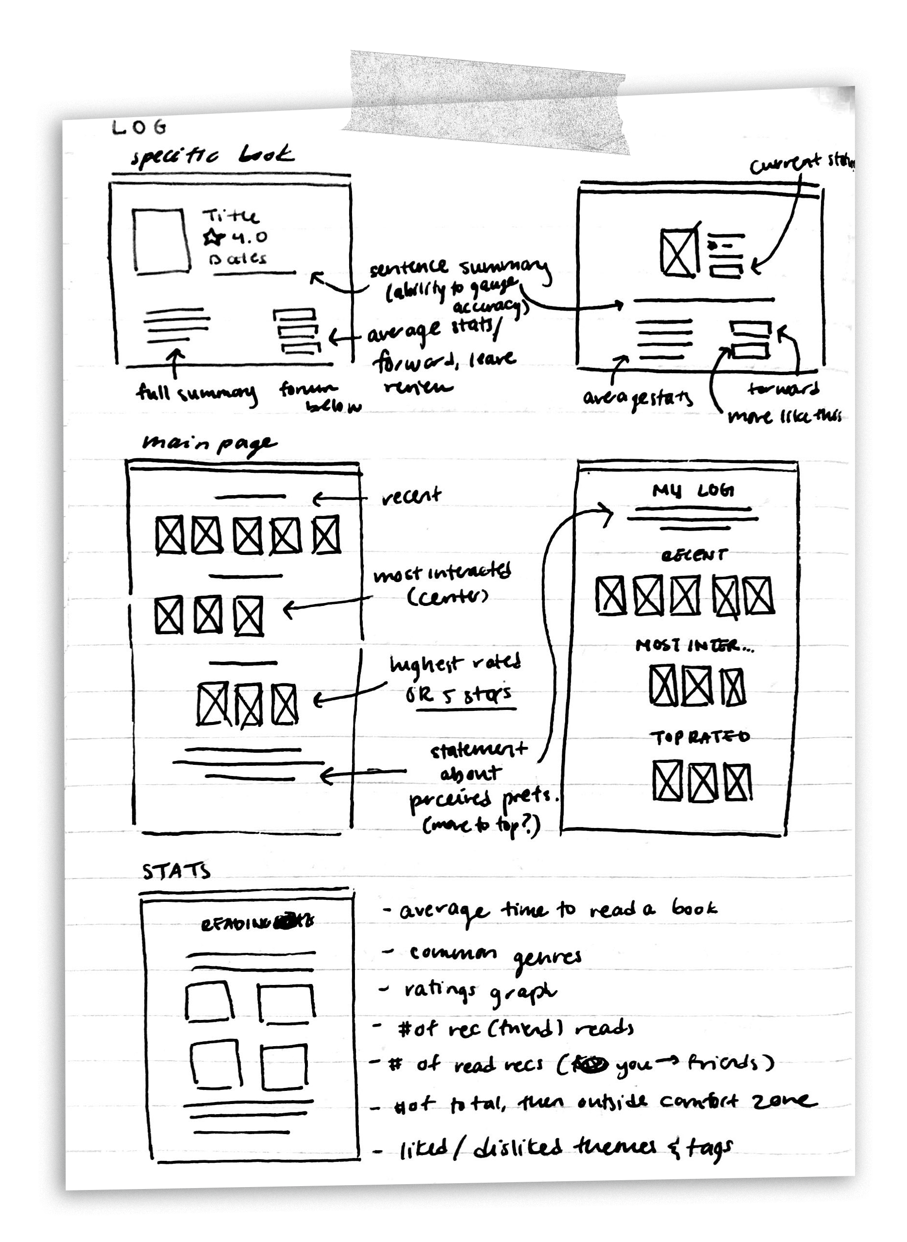
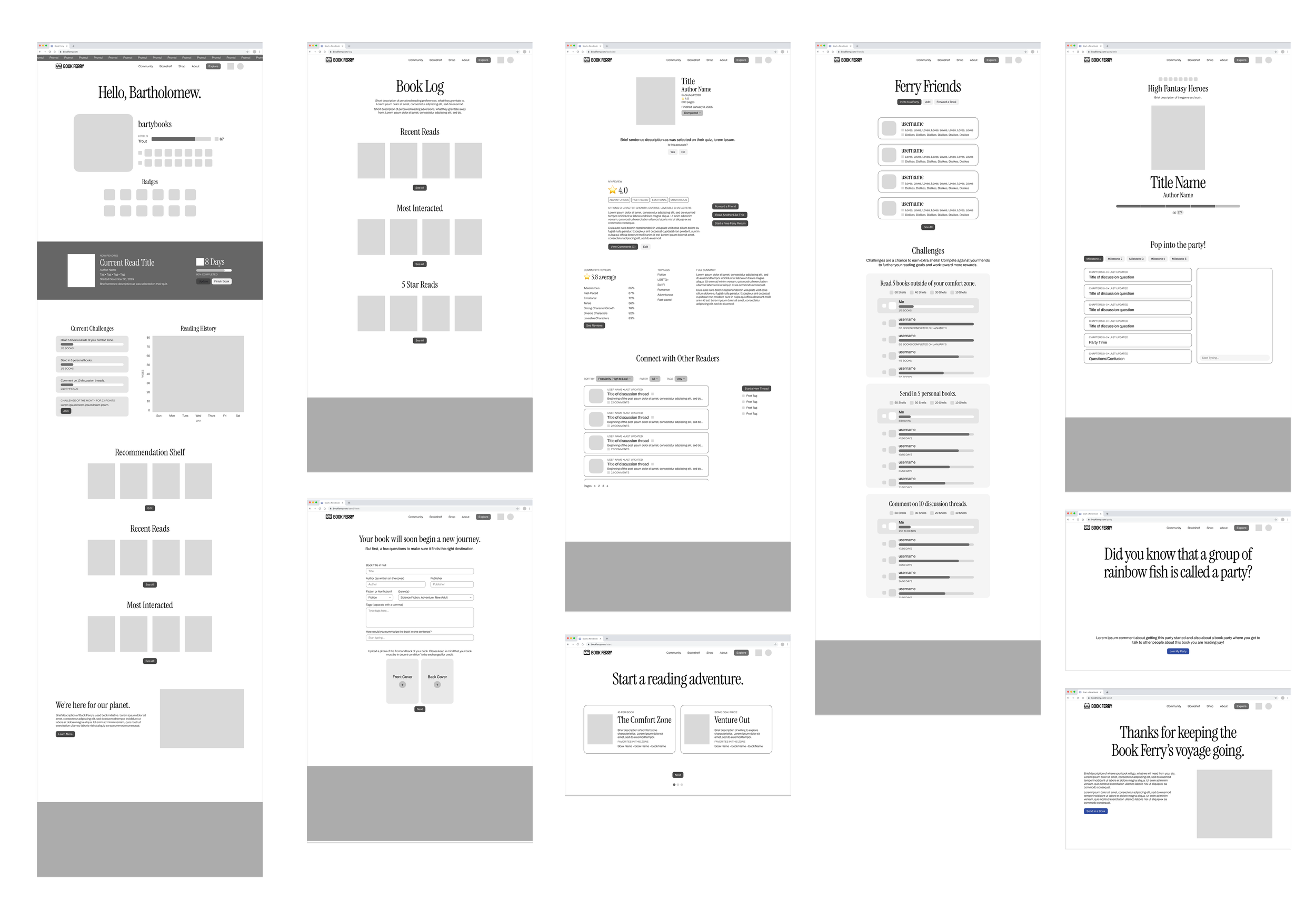
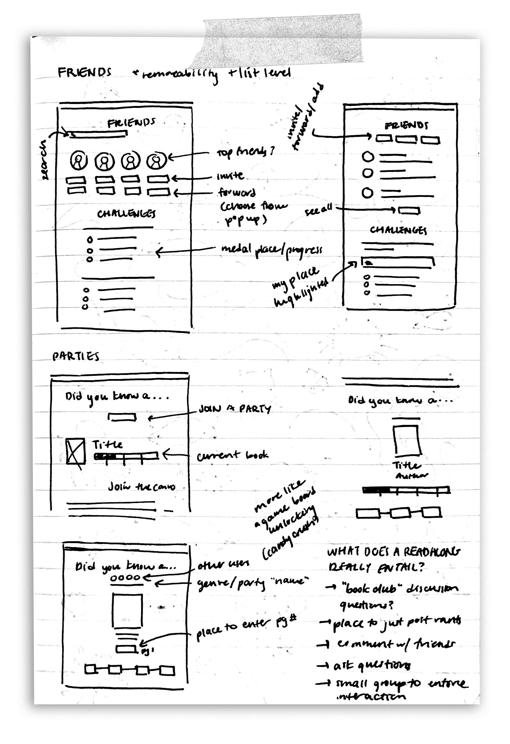
Starting with low fidelity sketches (a few samples below) and moving to mid-high fidelity wireframes in Figma to get a feel for the layout and flow of the site.
I then conducted user testing to ensure that the flow was intuitive and copy was straightforward.
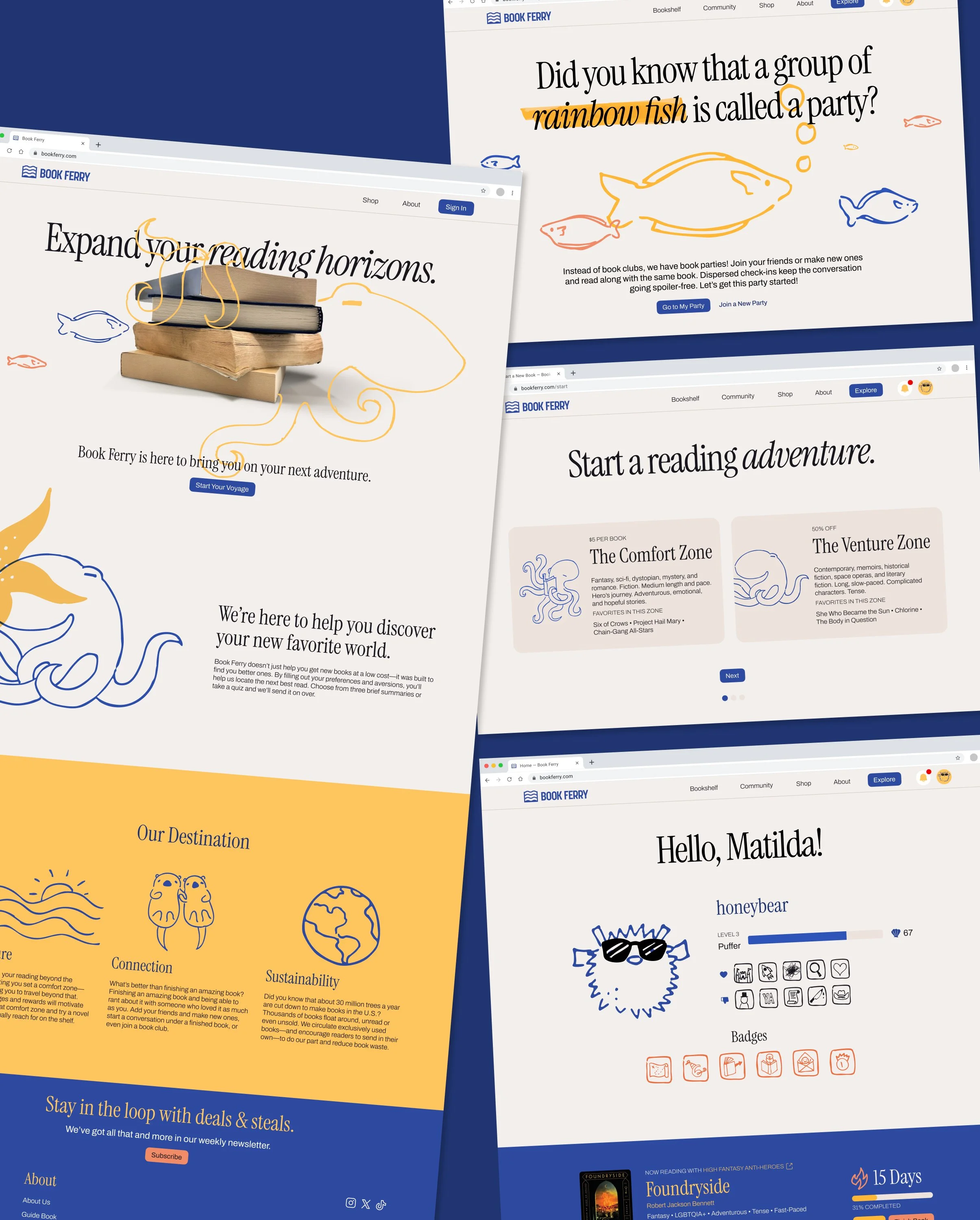
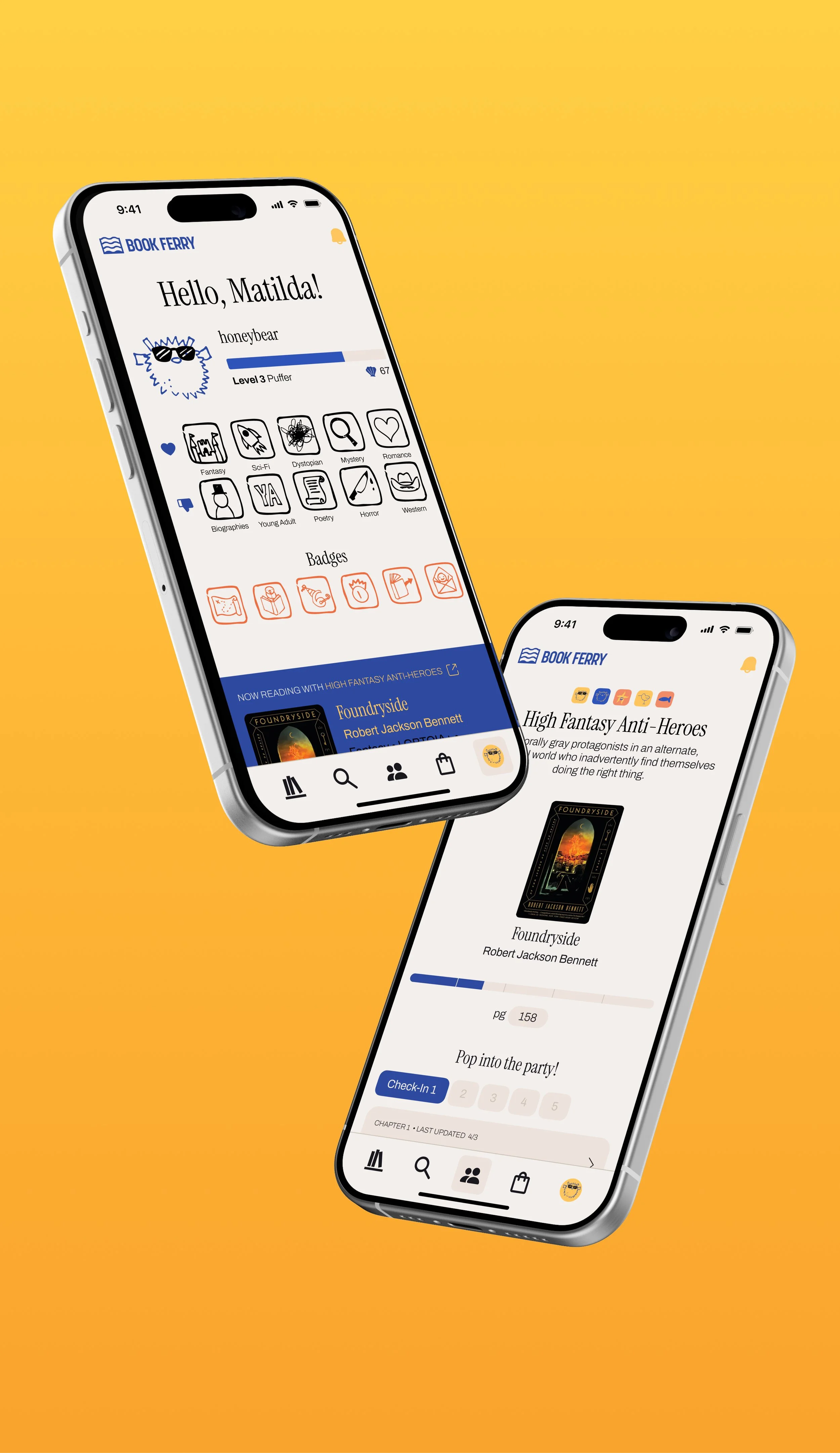
Final Web Design
Select Screens
A preview of some of the final screens from the Book Ferry website and mobile mockup. If you wish to view the full interactive desktop website, please visit:
Motion Design Process
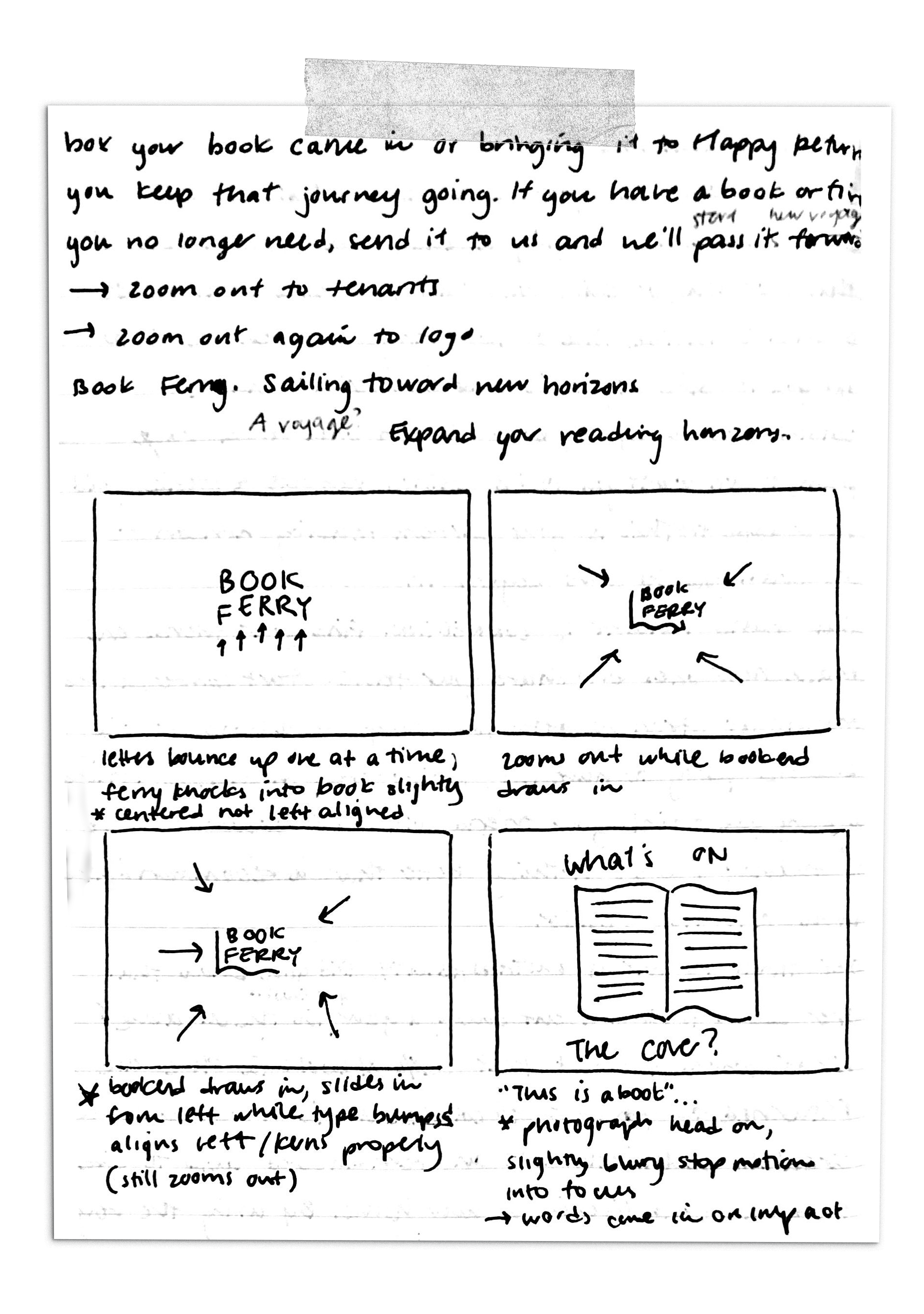
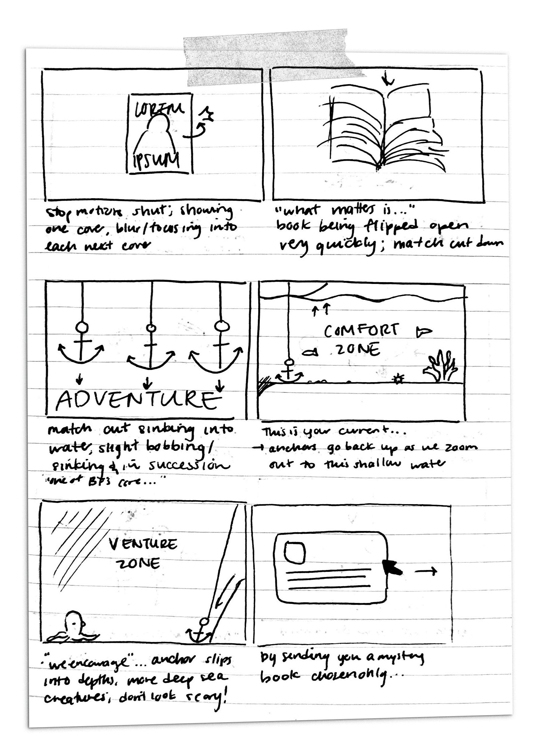
Storyboards
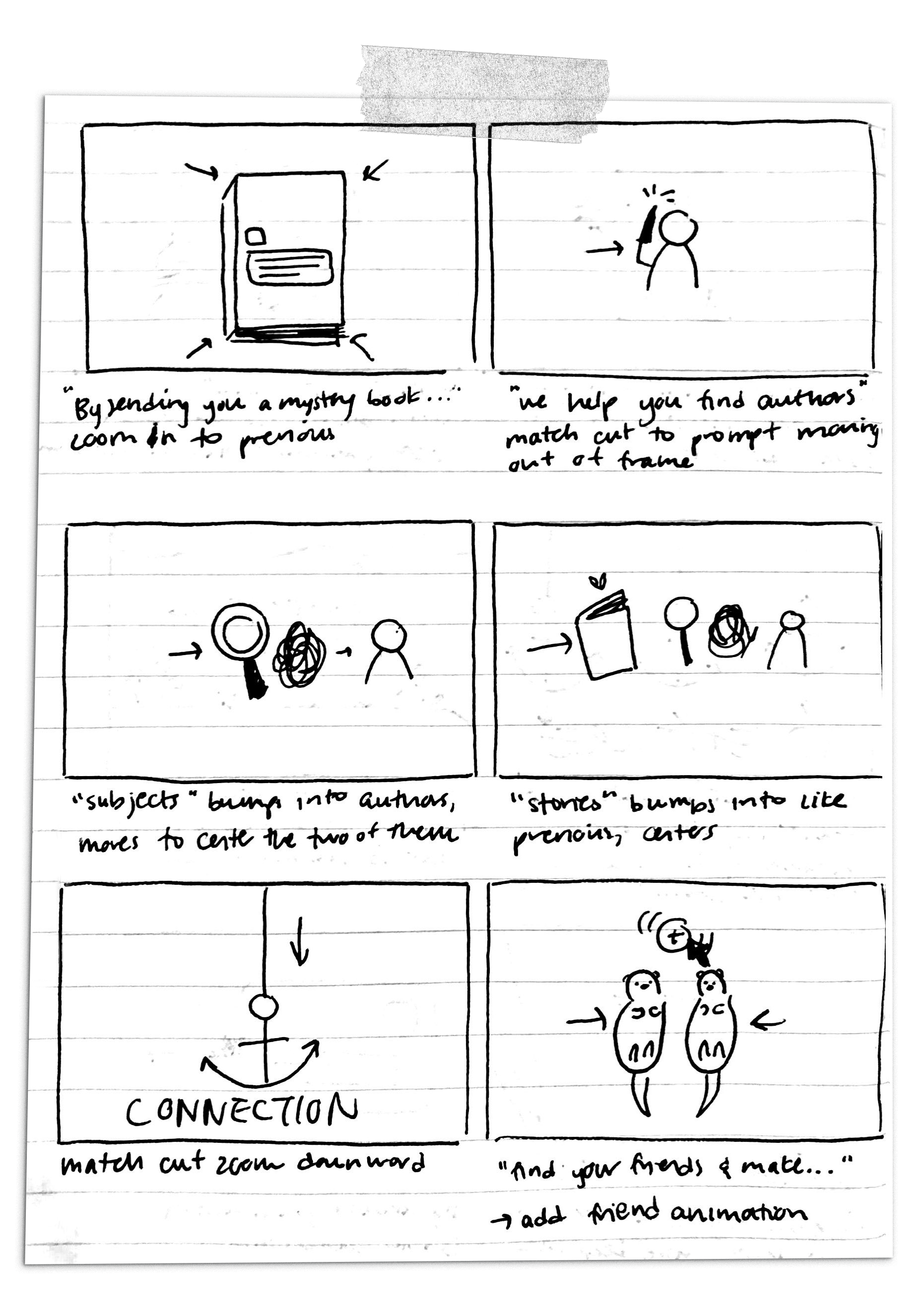
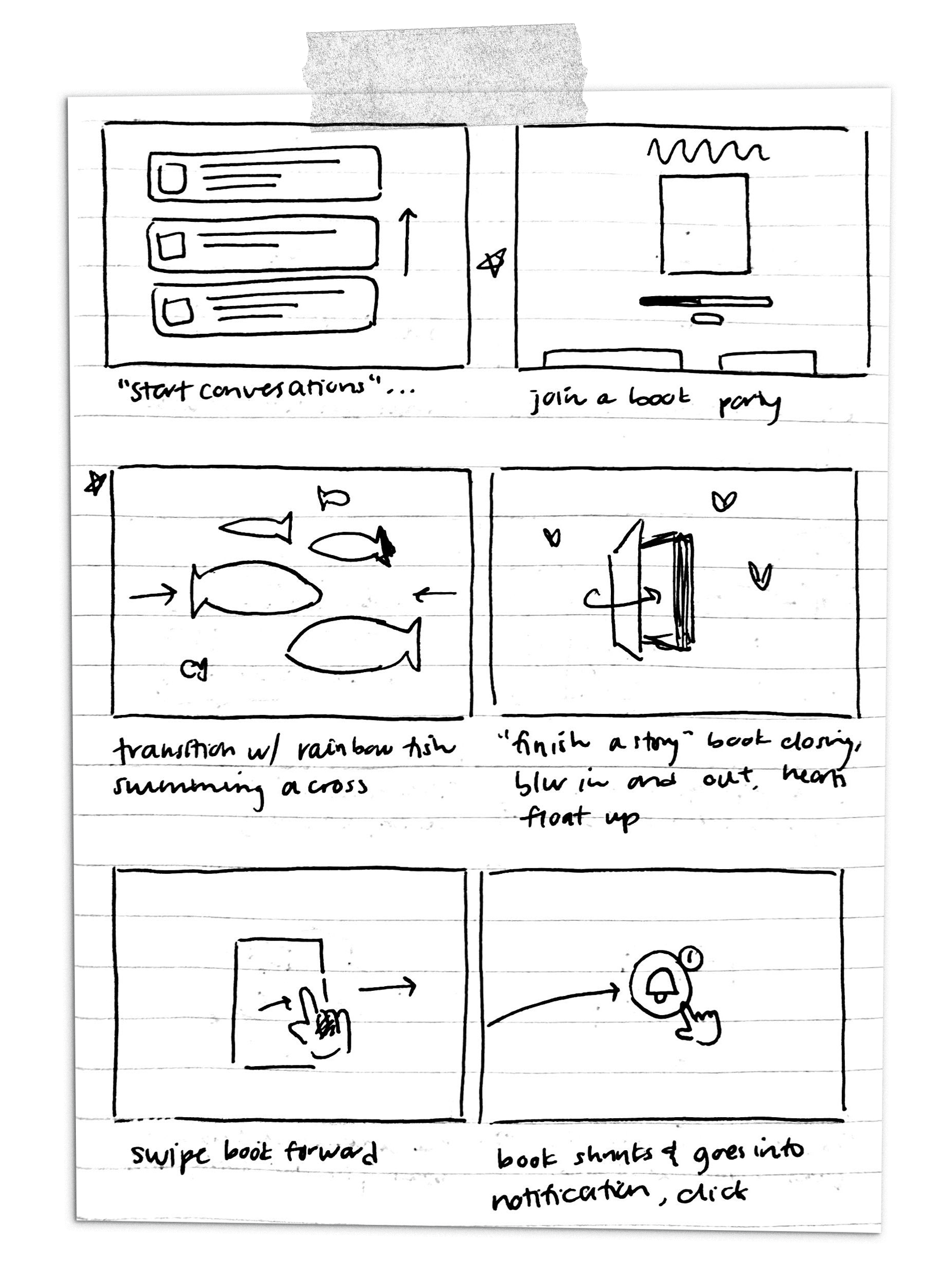
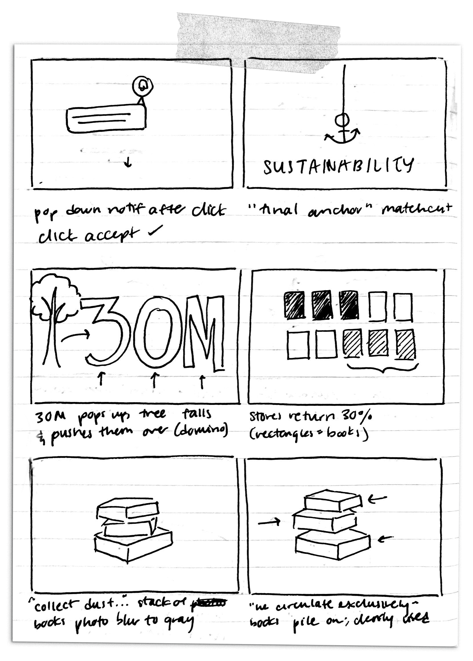
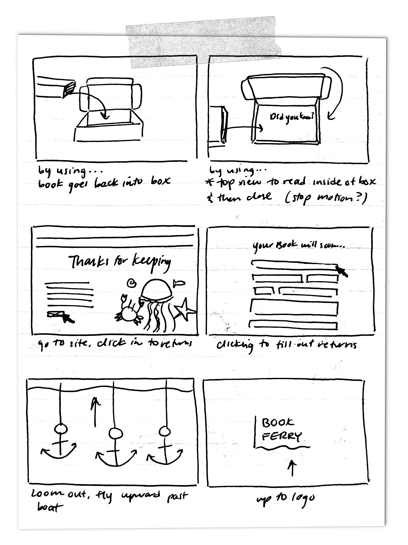
After writing out a script and editing it down along with some rough scamping, I began with loose storyboards to hit each beat in the script.
Final Motion Design
The Explainer Video
Using the storyboards as reference for an animatic and employing a friend for the voiceover, I put together the final video animation in After Effects with captions done in Premiere Pro. This is a culmination of the entire project, explaining the concept and execution in one digestible explainer video.
You may also enjoy…