YouTube Music
A redesign of YouTube Music to better serve user needs and convince non-users to migrate. YouTube Music is a music platform where users can access both pure music and any video on the YouTube site.
Software
Figma
Scope
UI/UX
Web Design
⊛
Mobile Design
⊛
User Experience
⊛
Web Design ⊛ Mobile Design ⊛ User Experience ⊛
The Background
What is the goal of this redesign?
What are the pain points and preferred features of music streaming services?
Project Objectives
Refresh YouTube music’s app and website interface and user experience.
Enhance the experience of music streaming platforms across the board, rather than simply catching up to more popular platforms.
Research
Audience
Though people of all ages and demographics would use YouTube music, our target audience/demographic is college students and early post-grad, ages 18–23.
Methods & Takeaways
Started with a user survey of my audience to get a feel for their listening and user experience preferences.
Interviewed a focus group of four people in my target audience range, who currently use Spotify or Amazon Music.
71.4%
of survey respondents preferred to shuffle play, while only 9.5% played playlists from the beginning. Most people prefer the randomization while emphasizing more recently added songs.
Tailoring
was a key point that came up across survey and interview responses—whether organizing their home page or having recommended playlists based on their listening habits.
Process
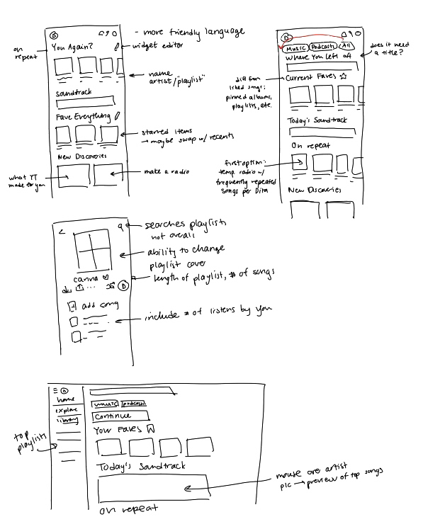
Low-Fidelity Wireframes
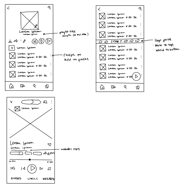
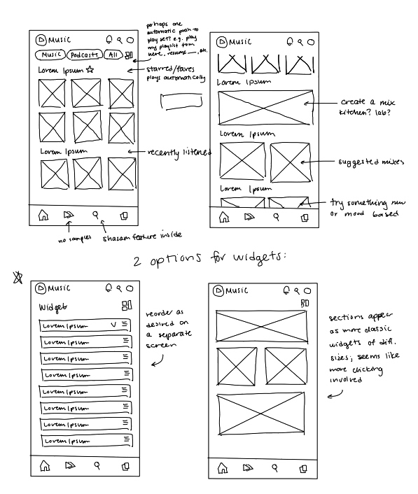
Mid-Fidelity Wireframes
Quickly figuring out key feature changes and placement within the existing UI.
Based on YouTube Music’s existing UI—to keep features familiar and easy to navigate—integrating changes with sizing and spacing in mind.
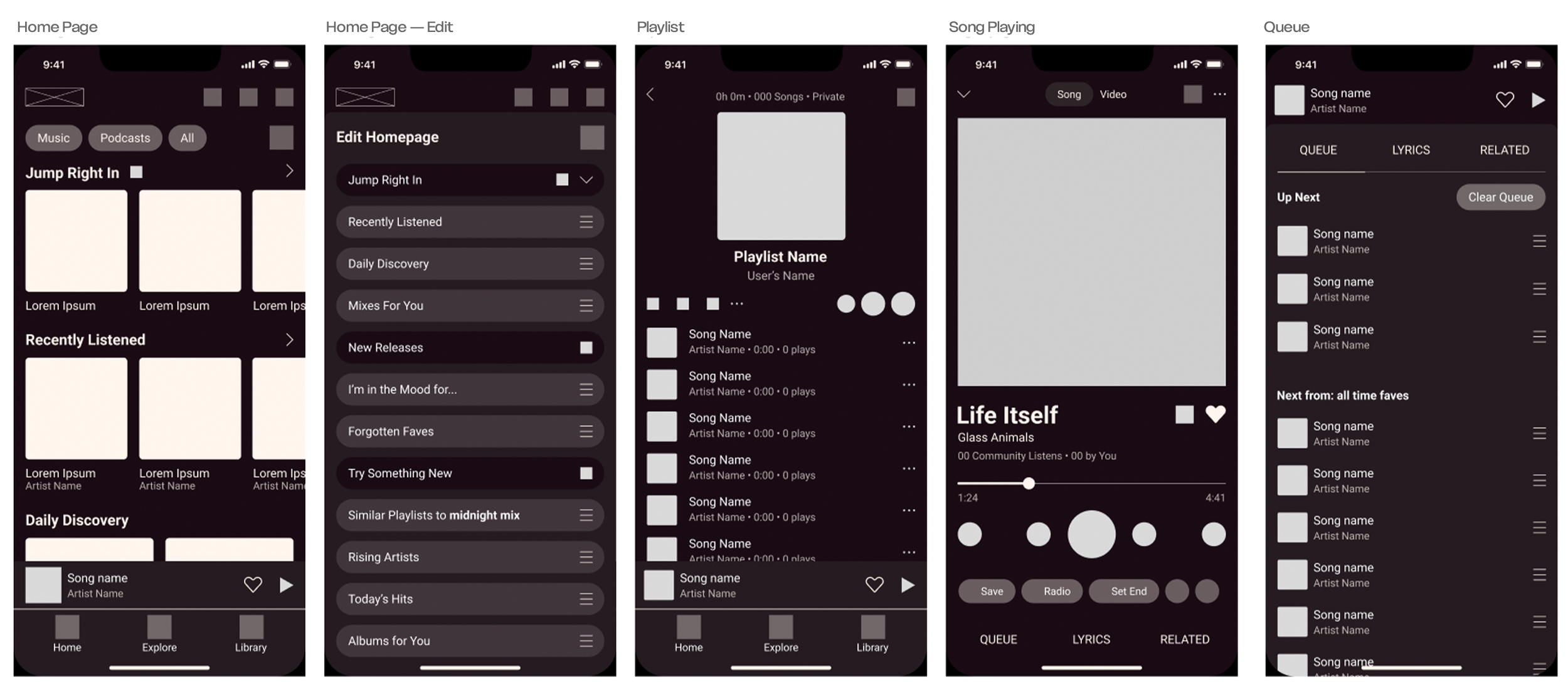
The Solution
How YouTube Music can integrate features to convince non-users to migrate.
Intuitive navigation and use.
Key Feature Changes
Simplified options, larger icons, and brighter colors to ease decision fatigue and create more visual interest
New feature: play from loop point, to create a playlist within a playlist
Distinct queue from playlist with first in, first out system
Personalization by allowing reorganization of the home page widgets/categories & customization of playlist covers
More intuitive access points to features such as liking, pinning, swipe to add to queue, search within playlists (reducing steps)
Desktop & Mobile Walkthroughs
You may also enjoy…