OLLY
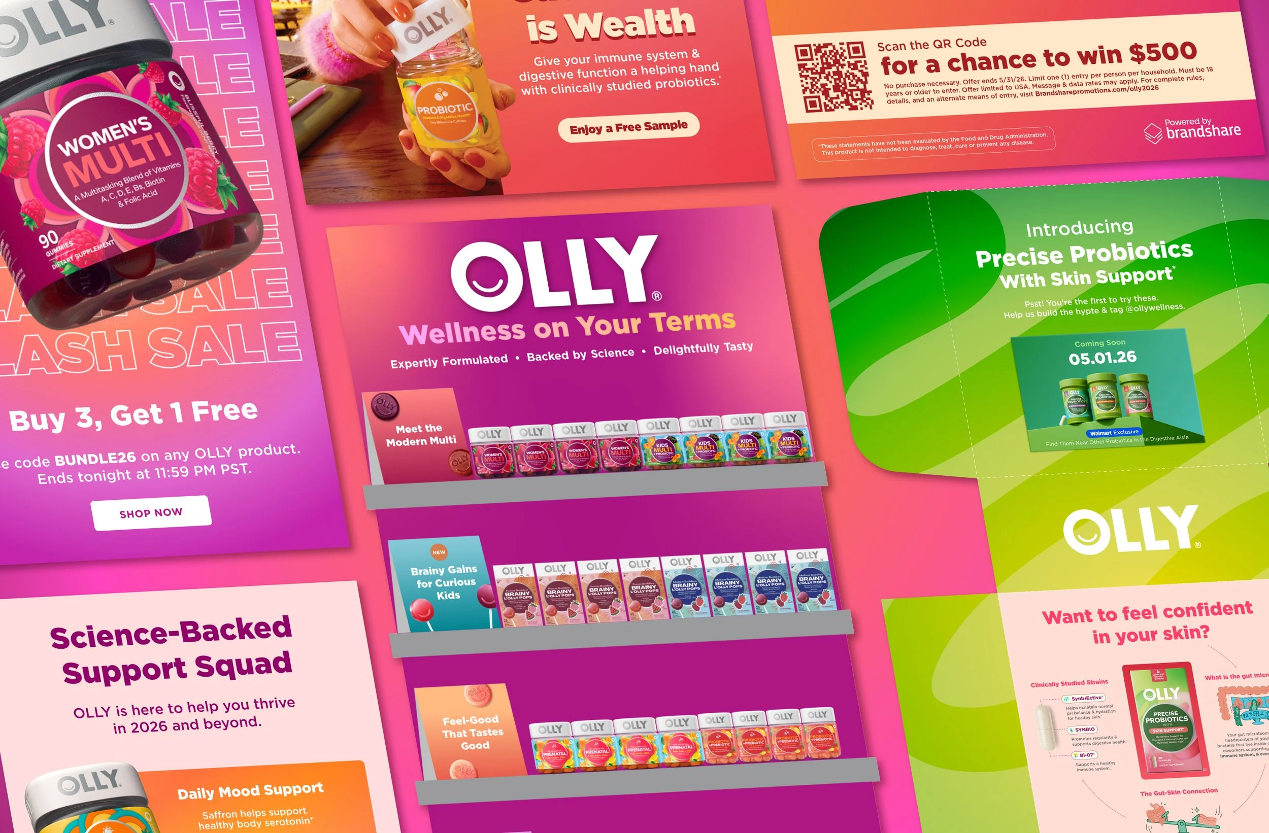
OLLY is the #1 Gummy Supplement Brand—a wellness brand that prioritizes delight, ease, and efficacy. As an Associate Designer, I've owned a wide range of projects across both digital and print executions. These marketing projects have resulted in record high impressions, sales, and brand awareness.
In collaboration with a dream team of copywriters & overseen by art directors + our design director, editorial director, and VP of creative.
Scope
Retail Design
Marketing Strategy
Advertising Design
Motion Design
Social Media Design
Packaging Design
Experiential Design
Software
Figma
Adobe Illustrator
Adobe After Effects
Adobe Photoshop
Want to jump around?
Hop to:
Digital Designs
Paid Social
Organic Social
Email
Digital Out of Home
Print Designs
PR Mailers & Cards
Displays
Merch
Bonus
Out of Home
⊛
PR Mailers
⊛
Emails
⊛
Organic Social
⊛
Paid Social (Static & Motion)
⊛
End Caps
⊛
Omni Digital
⊛
Merch
⊛
In-Store Signage
⊛
Sampling Cards
⊛
Out of Home ⊛ PR Mailers ⊛ Emails ⊛ Organic Social ⊛ Paid Social (Static & Motion) ⊛ End Caps ⊛ Omni Digital ⊛ Merch ⊛ In-Store Signage ⊛ Sampling Cards ⊛
Digital Designs
Everything from social to emails to digital out of home.
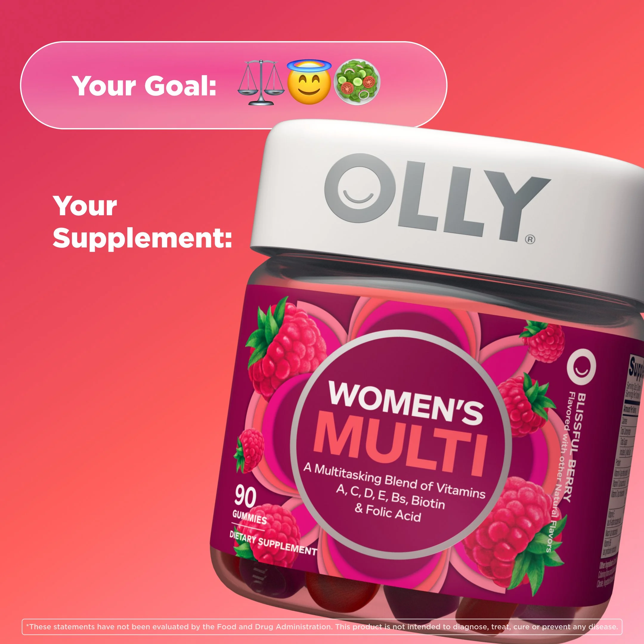
Paid Social
From prospecting to retargeting and remarketing, both static and motion ads placed across Meta, Snapchat, Reddit, and Pinterest.
Happy New You
Mid Funnel (Retargeting)
Tentpole New Year’s campaign.
Upper funnel assets completed by another designer. Showing one SKU to simplify variables to messaging changes.
This series of statics was for our Happy New You campaign, focused on versioning for a variety of audiences and to reduce fatigue.
Mid Funnel (Retargeting)

Tactic: Relatability
Messaging: New year, not new start

Lower Funnel (Remarketing)
Tactic: Educational
Messaging: Problem/Solution
Tactic: Delightful
Messaging: Ease in routine

Tactic: Efficacy
Messaging: Product RTBs

Lower Funnel (Remarketing)
Tactic: Delight
Messaging: Re-upping routine

Tactic: Efficacy
Messaging: Never run out w/ subscriptions
Precise Probiotics
New Q2 2026 product launch.
This series of ads was to kick off the launch of our new product line. Messaging is centered around education and a premium, effective product.
Each SKU has its own specific benefit (skin health, stress management, metabolism levels) along with gut and immunity health.
Showing one SKU to simplify variables to messaging changes.
Upper Funnel (Prospecting)

Tactic: Newness
Messaging: Efficacy made simple

Tactic: Efficacy
Messaging: Naming specific product solution
Mid Funnel (Retargeting)

Tactic: Efficacy
Messaging: Key buzzwords & product RTBs

Tactic: Site native
Messaging: Educational and eye-catching

Carousel Slide 1
Tactic: Education
Messaging: Problem/solution search

Carousel Slide 2
Since carousel ads can appear to consumers on either slide first, we wanted to make sure they both made sense on their own as well as together.
Mid Funnel (Motion)
Tactic: Education
Messaging: High level and digestible benefits
Tactic: Delight
Messaging: Hit the benefit jackpot
Upper Funnel (Prospecting)
Mid Funnel (Retargeting)

Tactic: Site native
Messaging: Straight-forward benefits
Lower Funnel (Remarketing)
Mid Funnel (Motion)

Tactic: Promotional
Messaging: Value emphasized by price strikeout
Tactic: Native Promotional
Messaging: Value emphasized by price strikeout
Lower Funnel (Remarketing)
Organic Social
Posts on @ollywellness for various purposes—promoting new products, leveraging products for a campaign, or tapping into Instagram trends.
Campaign: Evergreen
Goal: Create a playful Halloween post to drive engagement.
Design Rationale: After my copy partner ideated on Halloween costumes to match each project, I Photoshopped each SKU with distinctive items from each costume. Bold type and adjacent colorways make each SKU distinct, like a mini movie poster.
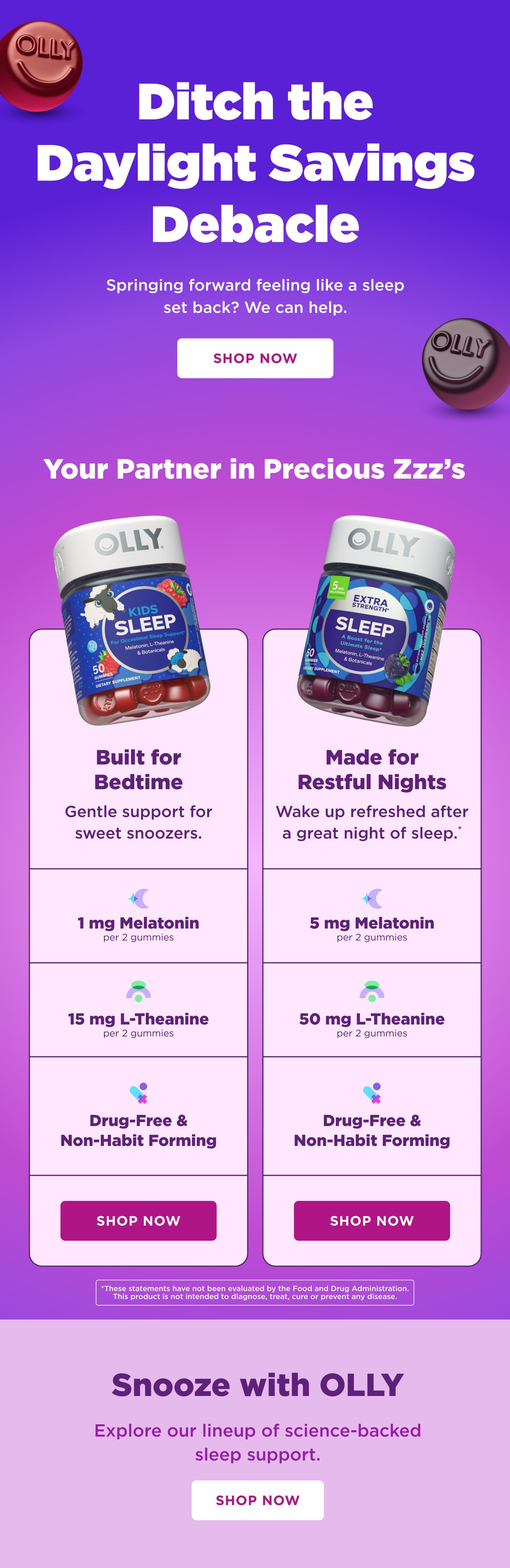
Campaign: Daylight Savings
Goal: Educate followers while emphasizing efficaciousness of OLLY Sleep products.
Design Rationale: A seamless background makes the carousel feel cohesive. A simple Q&A format makes content easily digestible, with out-of-pack gummies emphasizing the brand and delight factor.
Campaign: Happy New You
Goal: Create a playful motion video at the intersection of nostalgic video games and product education.
Design Rationale: Used a retro typeface sparingly with OLLY’s classic Gotham in high-impact areas. Sound effects clarify actions and graphics that all emulate an 8-bit video game.
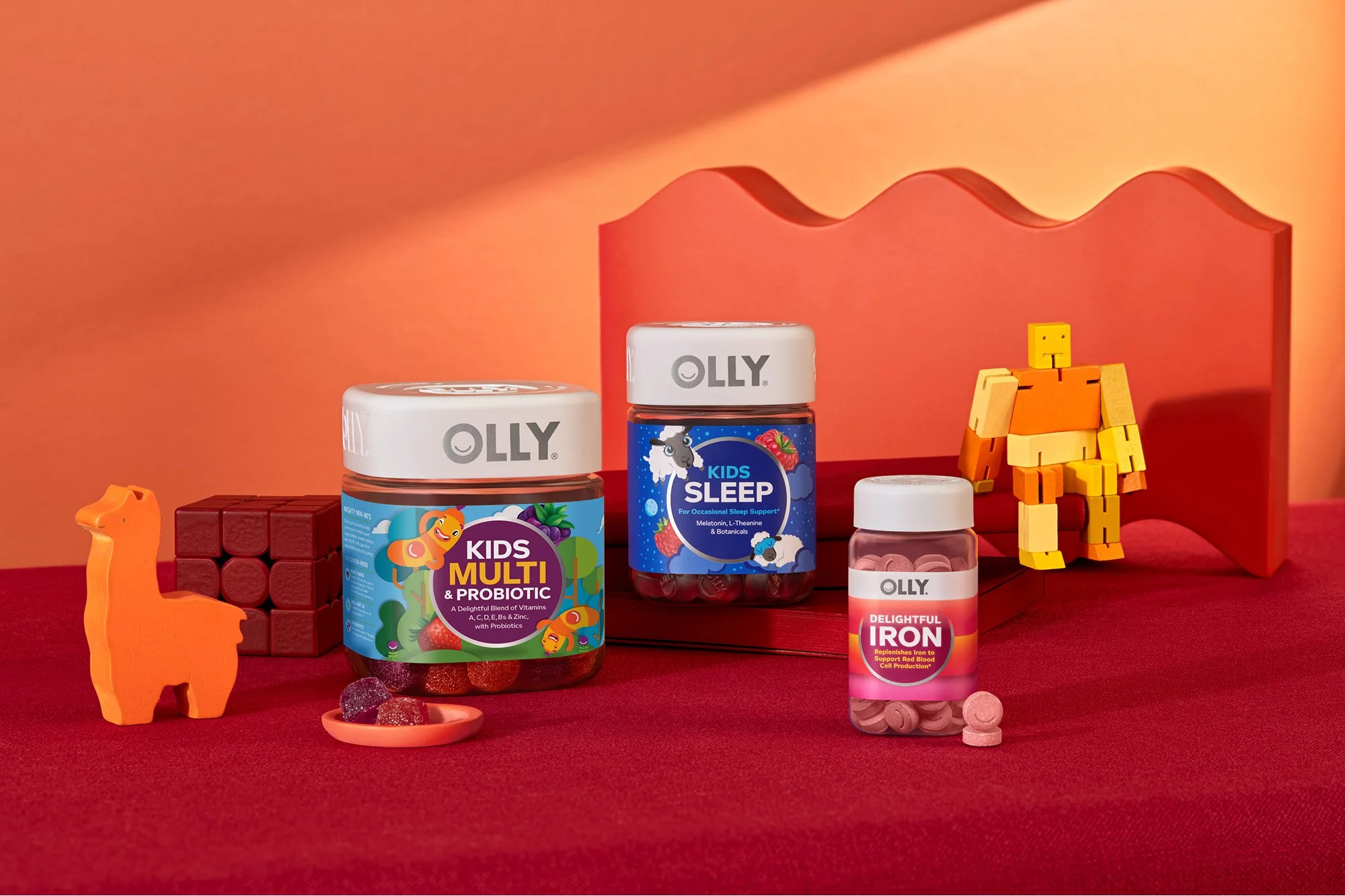
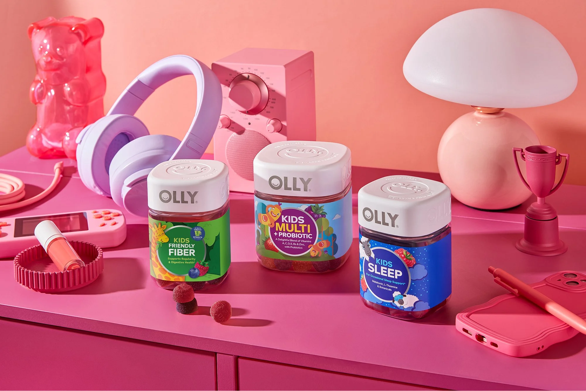
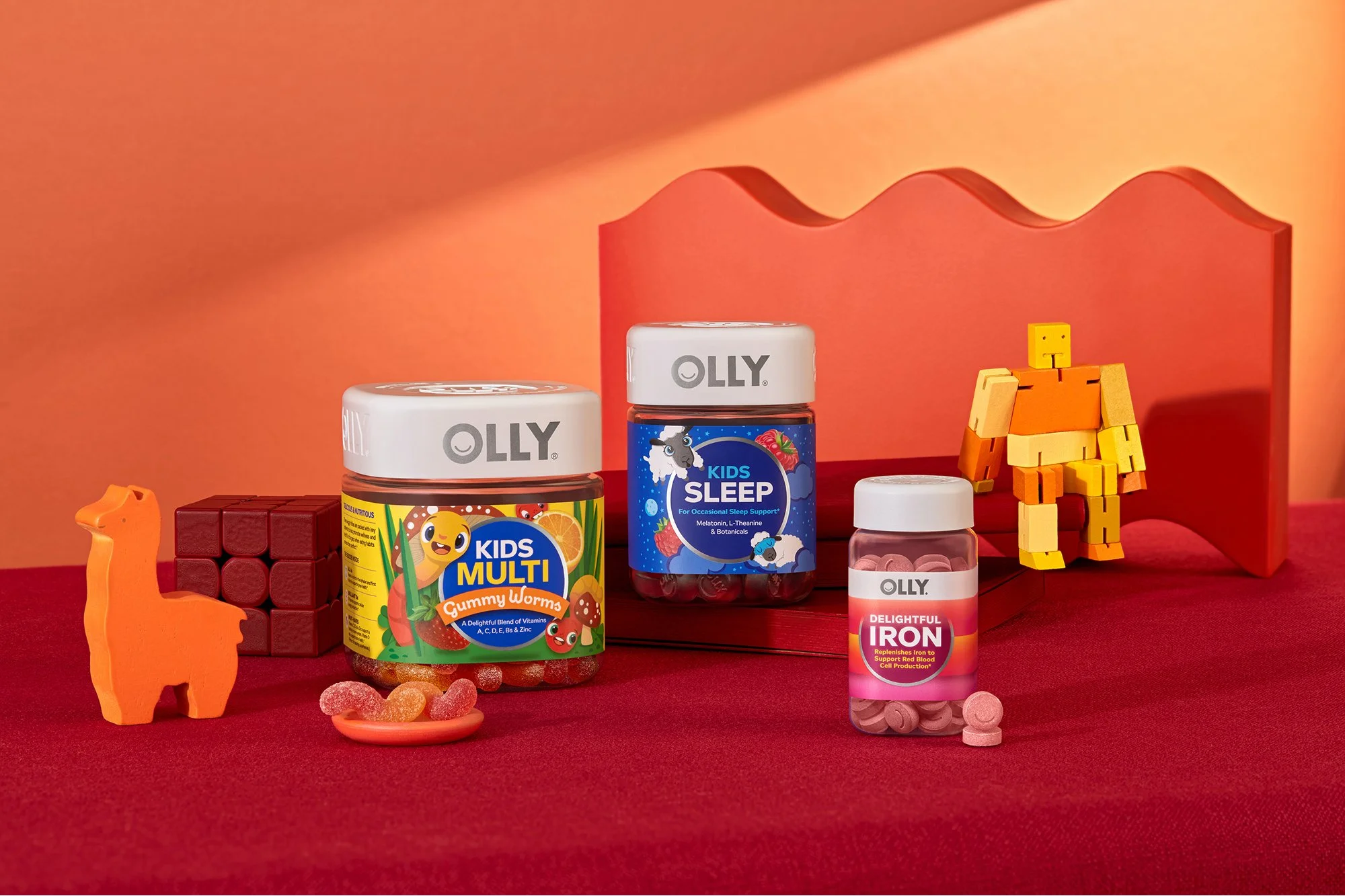
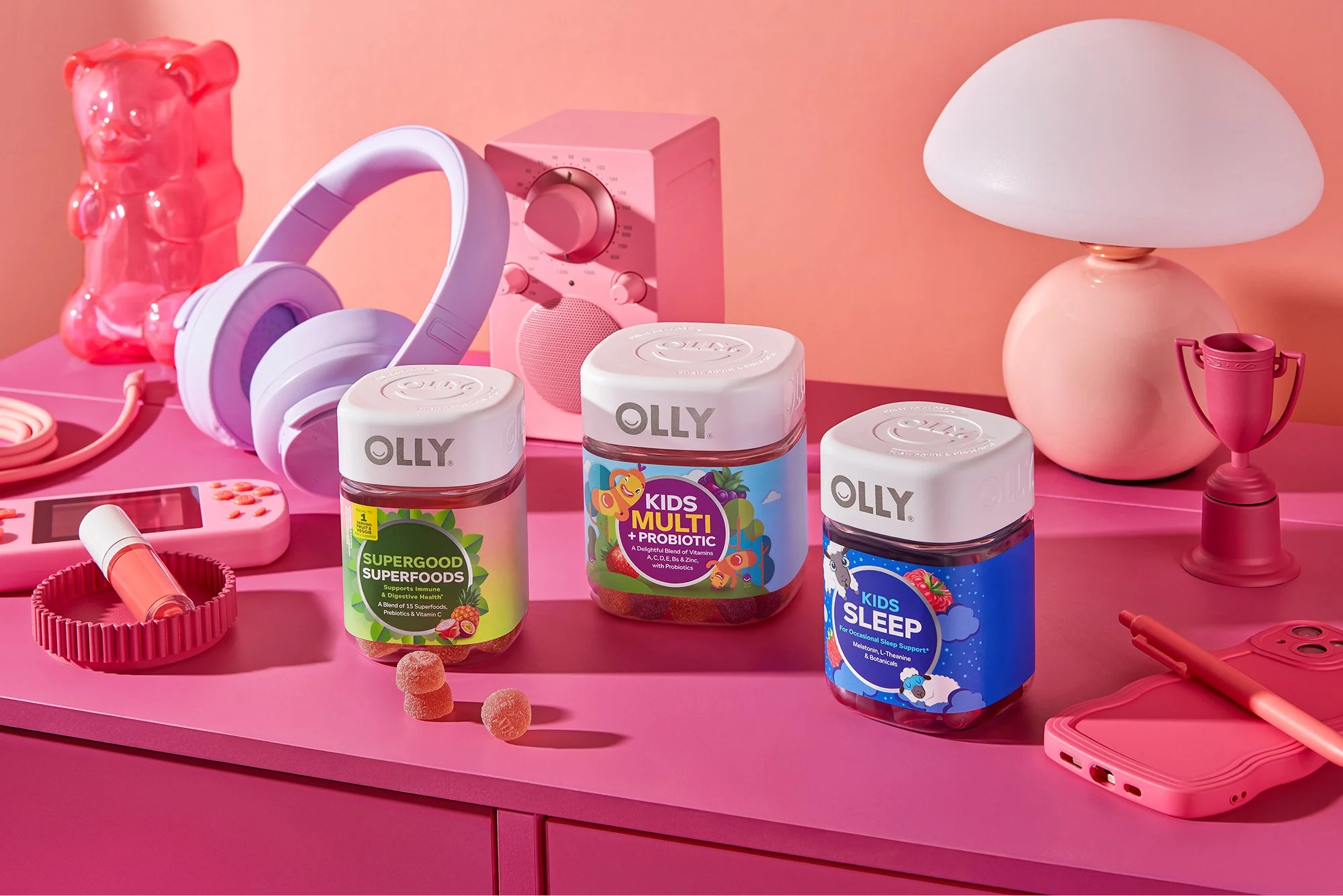
Campaign: Kids’ Fiber Launch
Goal: Lean into delight of this kids’ product while still educating on new benefits. Driving readership to OLLY’s blog, The Well.
Design Rationale: Leaning into 8-bit design elements and audio, mirroring other paid ads for the launch. Playful, bright, and reiterating information in a new way.
… two executions with two different goals.
Two comparison emails…
Email Campaigns
Email executions with various purposes and metrics-based design decisions.
Campaign: Daylight Savings
Goal: Demonstrate benefits for two SKUs with very similar ingredients and purposes.
Design Rationale: Side-by-side comparisons of similar SKUs continually perform the best, especially if ingredients/benefits line up. It allows for a quick scan to see which product fits their needs better.
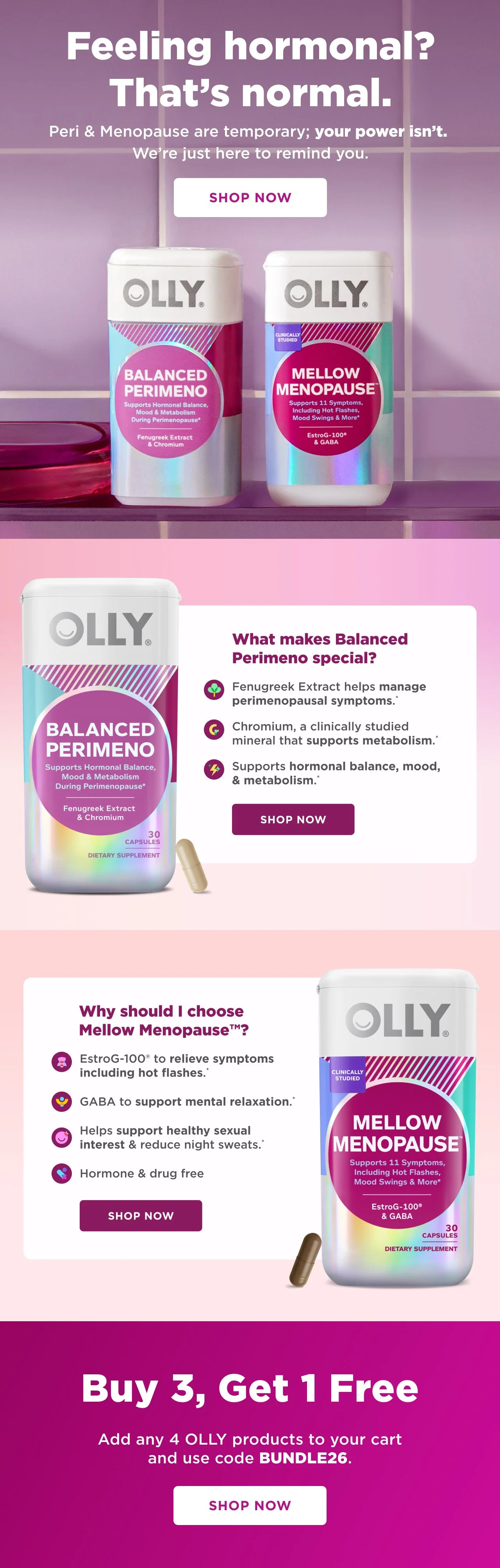
Campaign: Happy New You
Goal: Showcase two Women’s Wellness products with different ingredients and purposes.
Design Rationale: Because these products are more complex and/or unfamiliar to new customers, distinct sections allow for elaboration on individual product benefits. There is no logical 1:1 comparison.
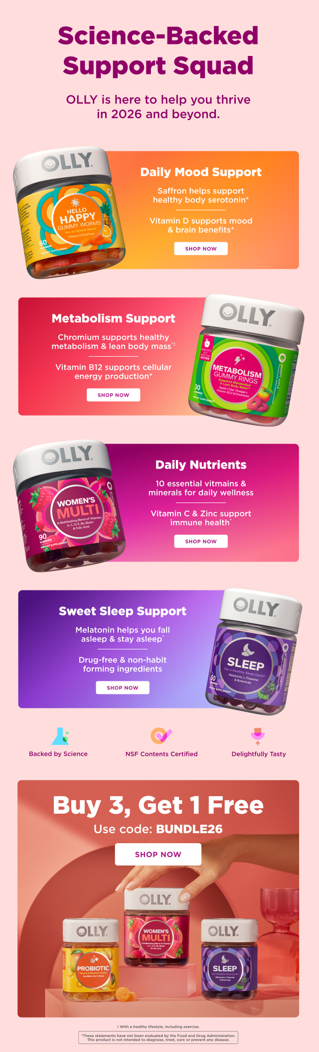
Campaign: Happy New You
Goal: Showcase hero products with hard-hitting claims. Emphasize science-backed status.
Design Rationale: 3D renders and matching bright colors catch the eye, while alternating placement creates digestible flow.
Campaign: Evergreen
Goal: Encourage customers to participate in a BXGY sale.
Design Rationale: Subtle macro bottle movement and bold, flashy type grab attention as soon as a customer opens the email. Keeping the email as straightforward as possible to drive clicks and reduce clutter.
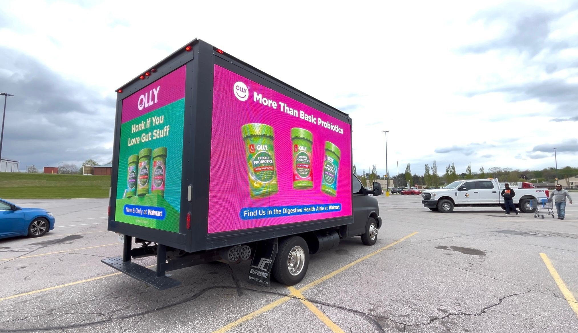
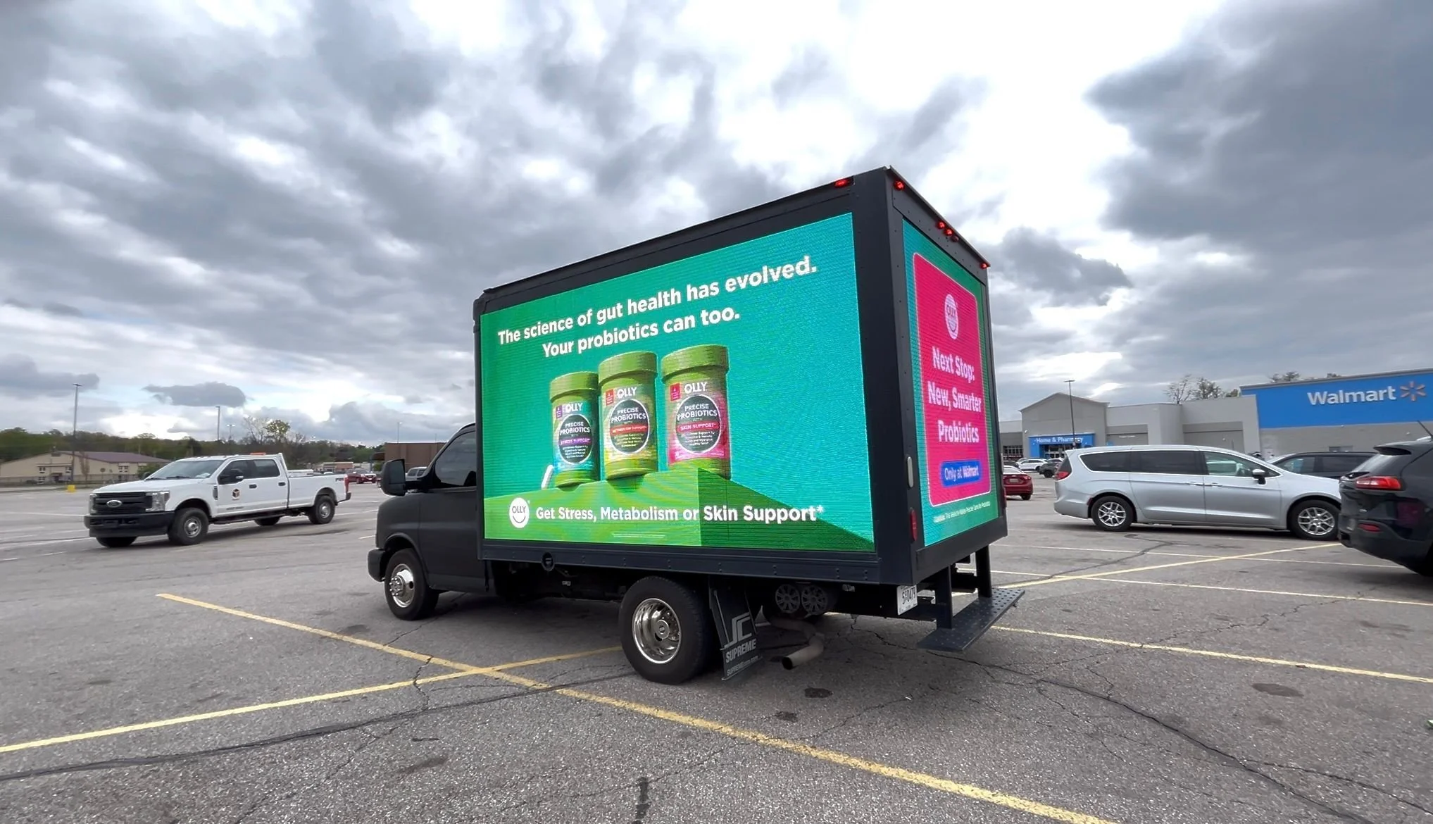
Digital Out of Home
Out-of-home executions with motion for large-scale visibility. These digital OOH assets were for our Precise Probiotics launch, hitting on strong educational claims and eye-catching motion.
Walmart Trucks
These trucks drove around Walmarts in the Chicago area, playing the same video on both sides with static imagery on the back. Back-of-truck visuals and storyboards by Abby Burke, motion execution by me.
Nashville Billboards
These were two of seventeen placements in Nashville Yards. Both videos wrap around the corner of building; this seam is indicated by the thin white lines (not present in the final video). Storyboards by Abby Burke, motion execution by me.
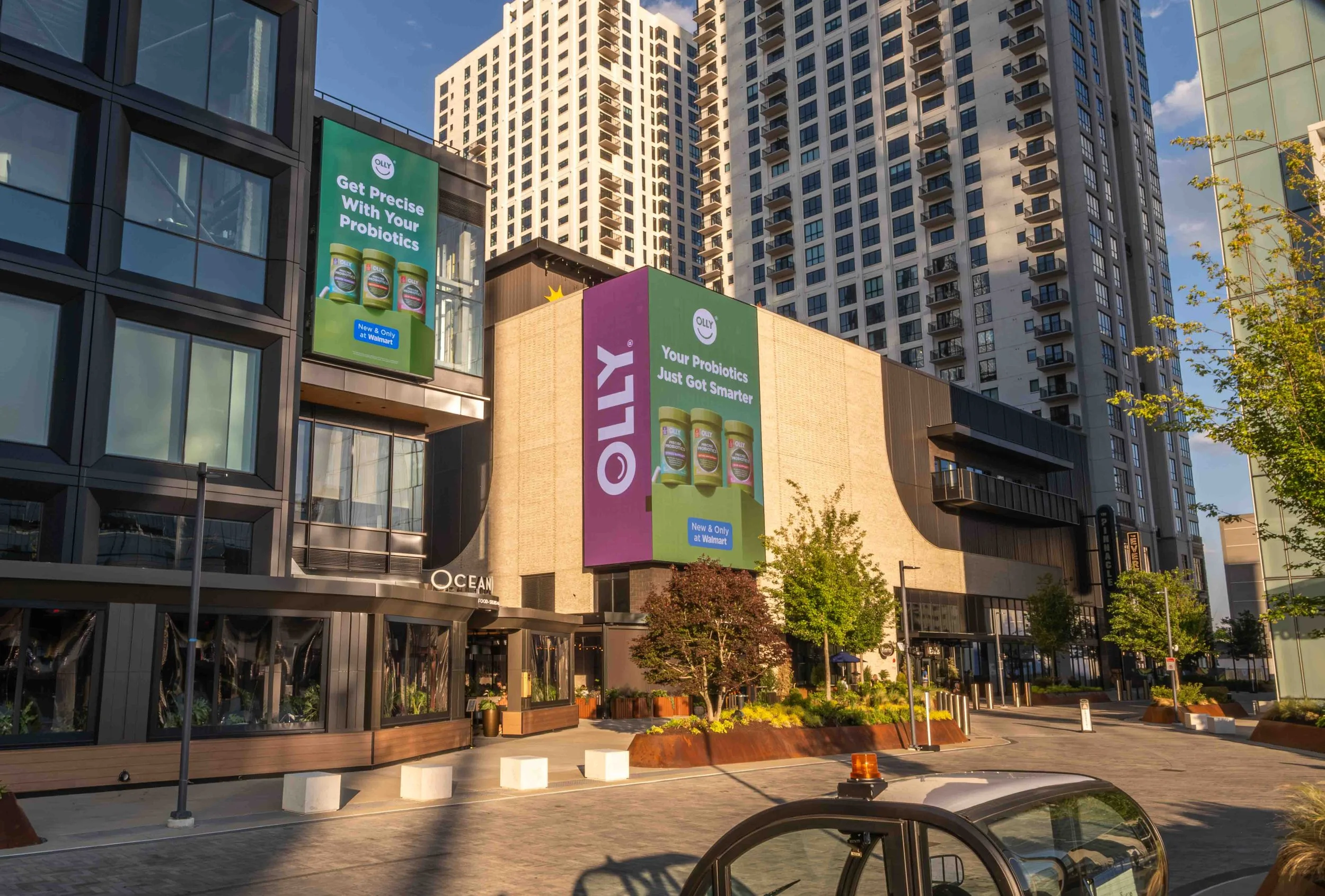
Photo of video placement on the corner of the building.
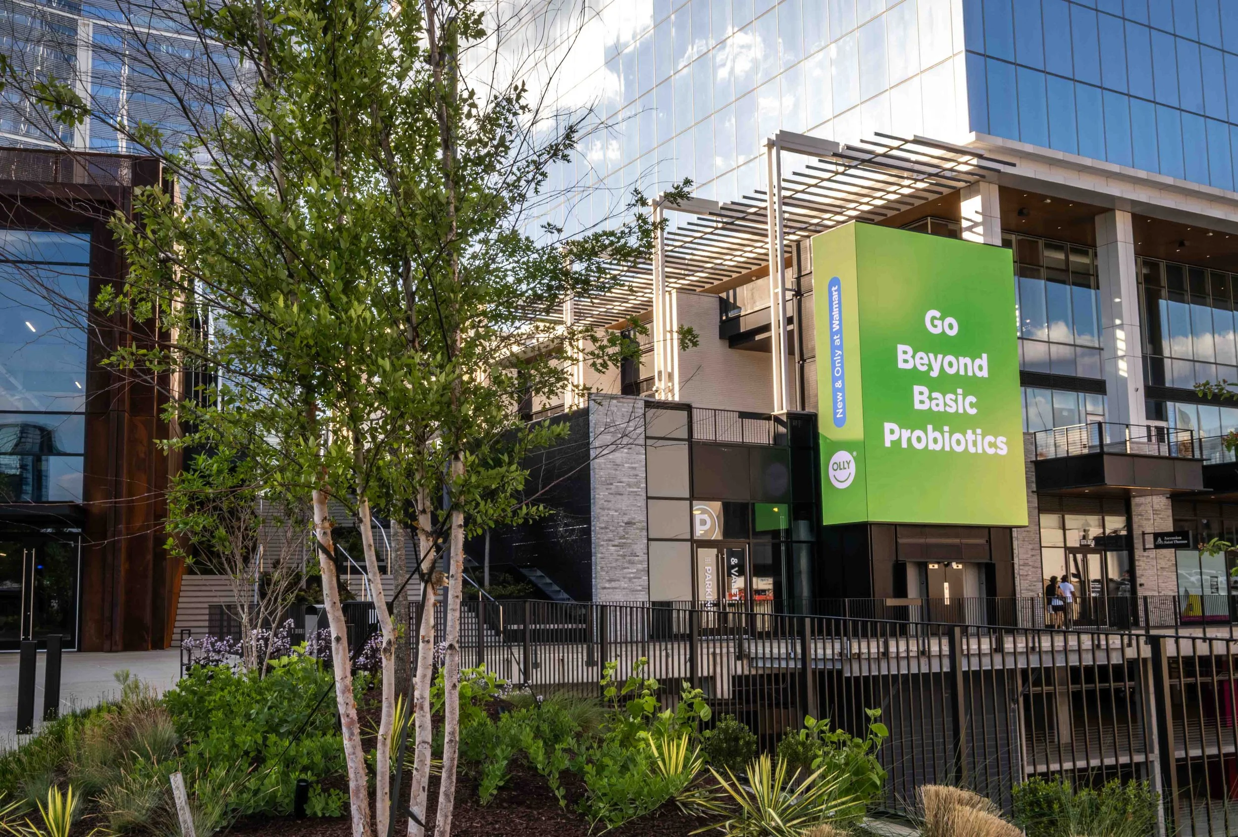
Photo of video placement on the corner of the building.
Print Designs
Everything from PR materials to endcaps to merch.
PR Materials
PR boxes sent to influencers and ambassadors, along with sampling cards sent to customers to promote specific products and campaigns.
Happy New You
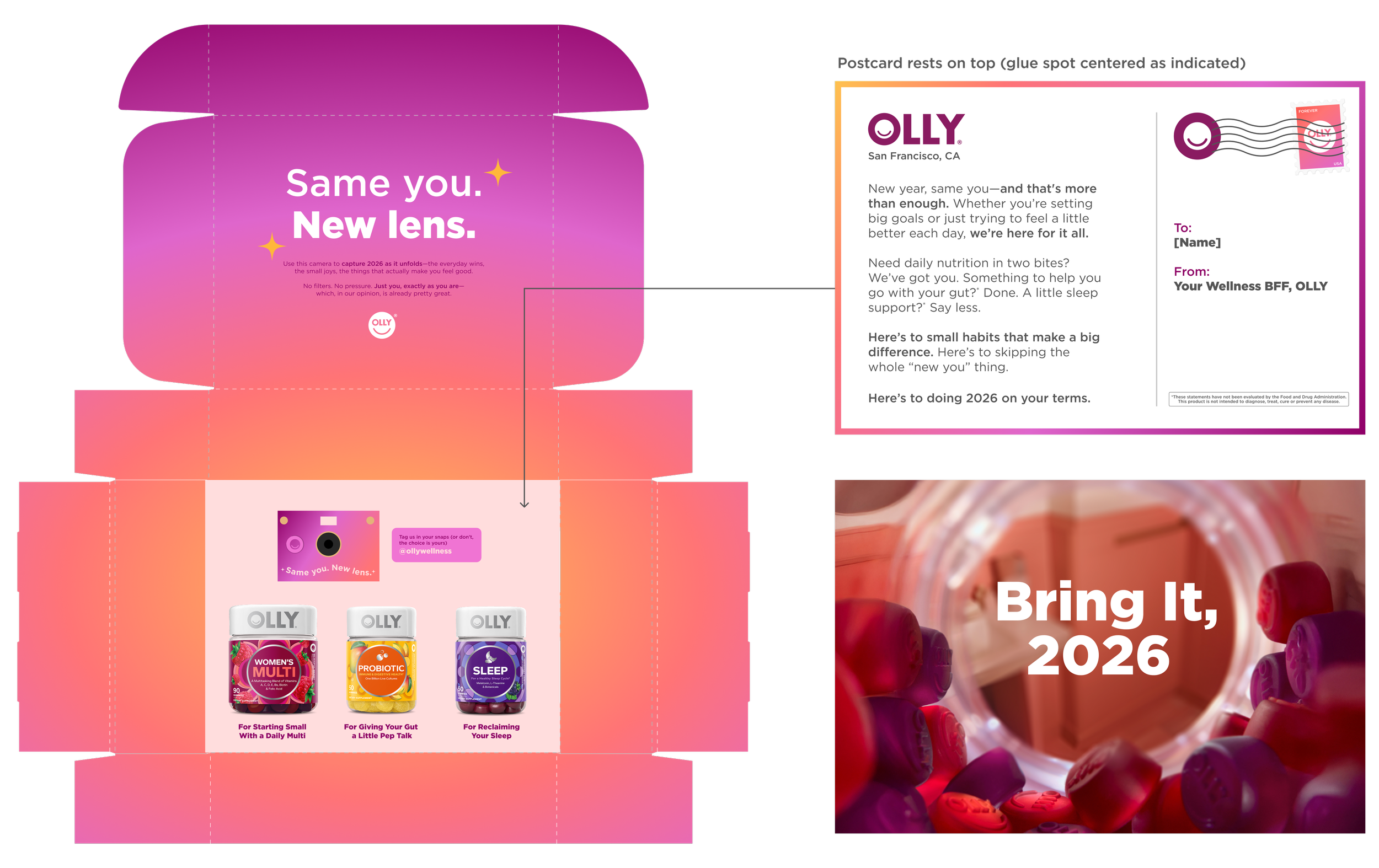
Original mockup of the HNY mailer.
This PR mailer was sent to 75 influencers and TYB ambassadors. The goal was to earn social media coverage, inspiring low lift New Year’s rituals.
The original brief suggested a branded disposable camera—I recommended (and implemented) a more sustainable digital camera from Paper Shoot, in closer alignment with OLLY’s sustainability mission.
Video showcasing final mailer & components.
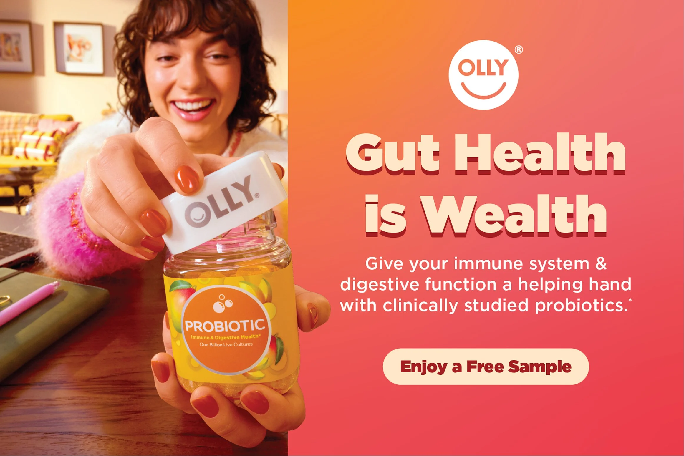
Precise Probiotics
This PR mailer was sent to 1000 influencers and TYB ambassadors—one product per person, depending on their wellness goals. The project goal was to educate our community about the new product and advertise availability at Walmart.
Though the product is only 2.2 inches tall, the box was required to be 10”×10”. I took advantage of this extra space by implementing more education and leveraging side-of-pack illustrations.
Original mockups of each Precise Probiotics mailer.
Sampling Cards
Two different mailing cards—both including a free sample of a specific product. The goal of both was to introduce people to OLLY’s tasty and delightful gummies—increasing brand recognition and conversion.
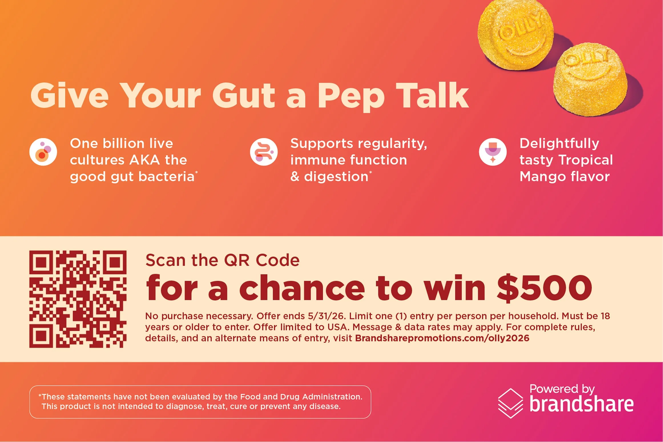
Front and back of an evergreen sampling card for Probiotic Mango. Styled with colors and imagery from Happy New You due to similar timing.
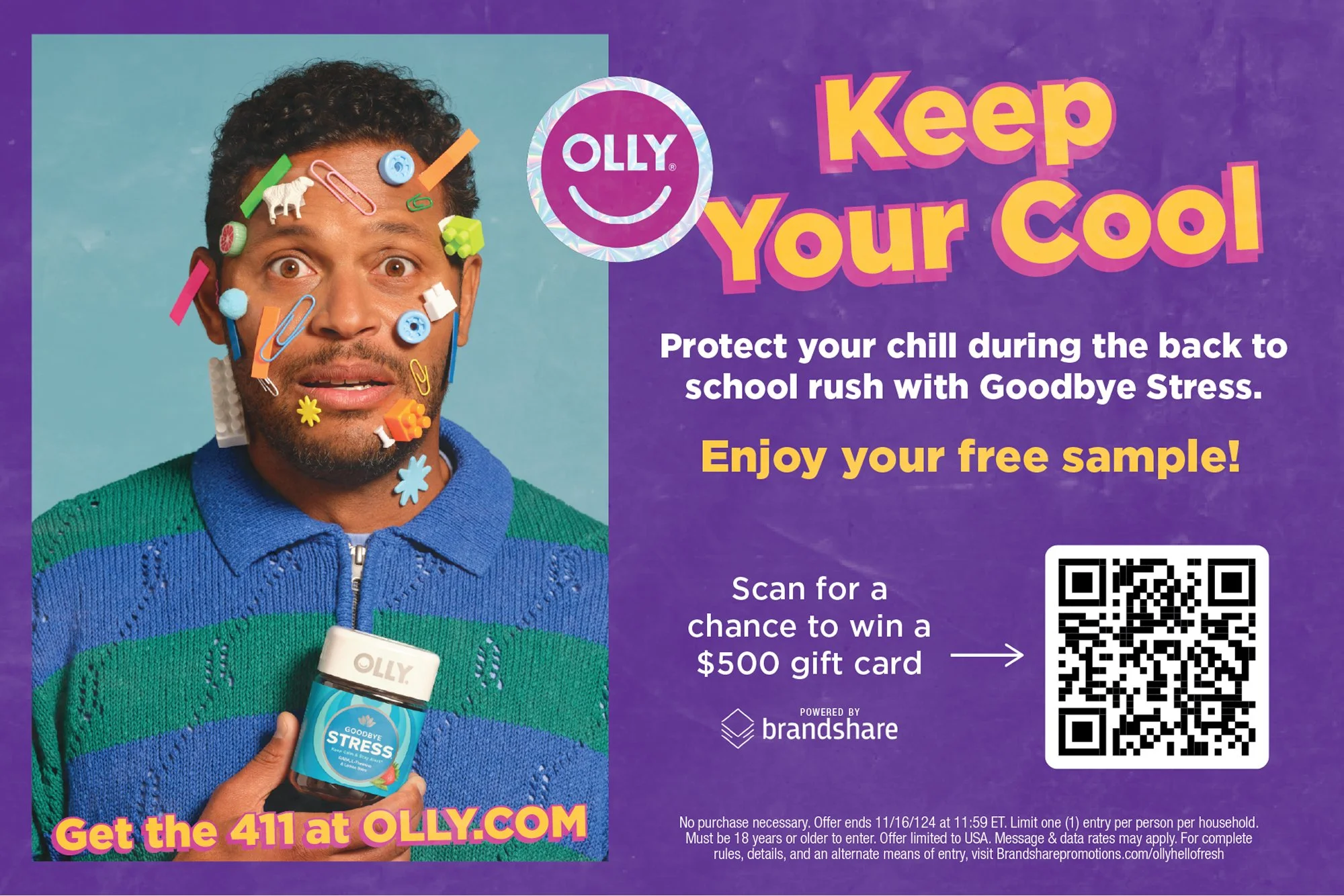
Front of a Back to School sampling card for Goodbye Stress. Back of card was provided by vendor. This year’s Back to School campaign styling included retro colors and stickers.
Displays
Various in-store displays for major campaigns and visibility. From floor stands to end caps, these displays are attention-grabbing and provide a high-traffic platform to display campaign messaging.
Happy New You
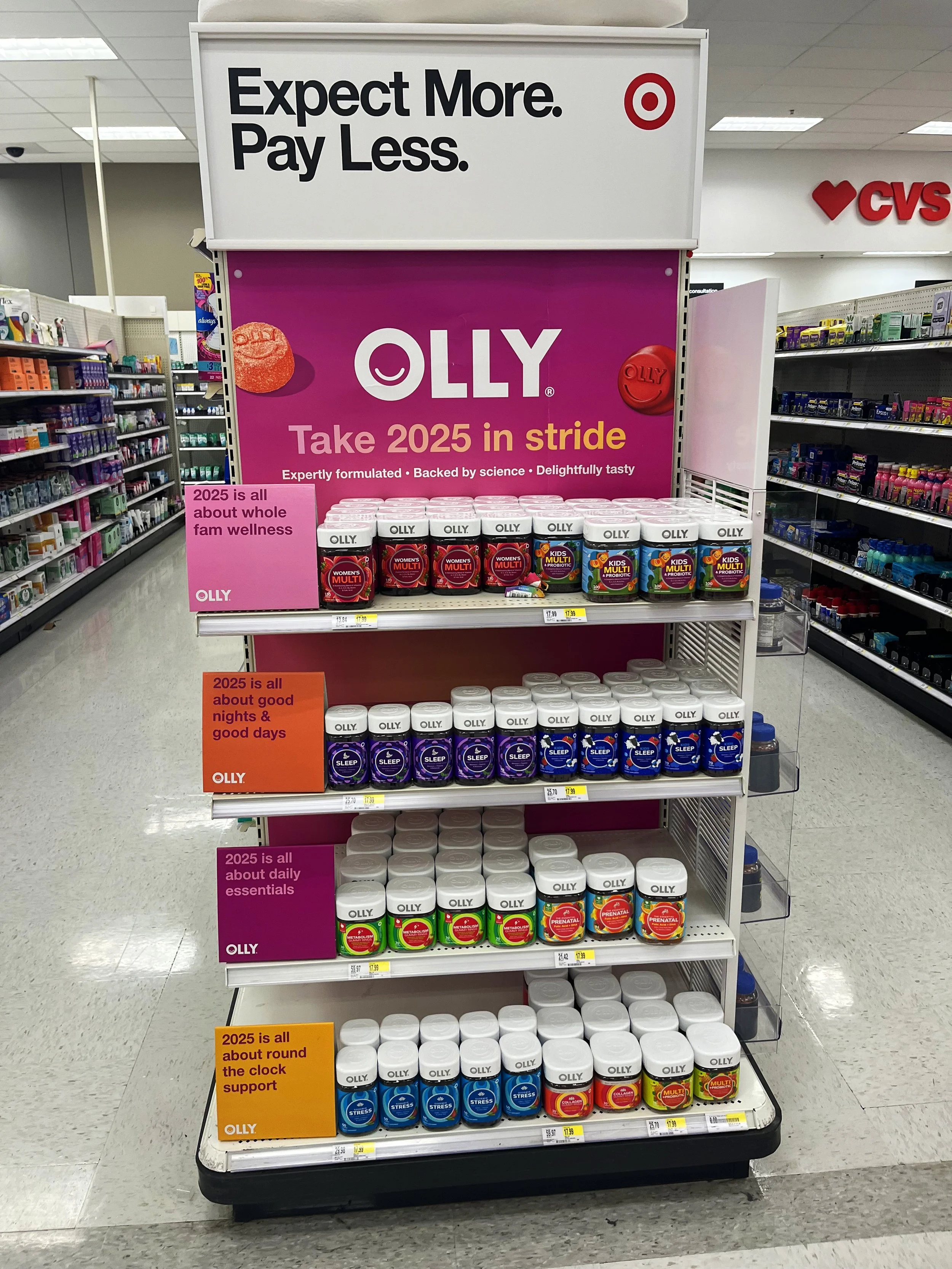
2025 New Year’s endcap in Targets nationwide. Bright campaign colors and out-of-pack gummies draw the eye, and repeating copy emphasizes the campaign messaging.
Spotted in Branchburg, NJ. Some Target locations placed the header much lower than intended, leading to adjustments in future endcap executions.
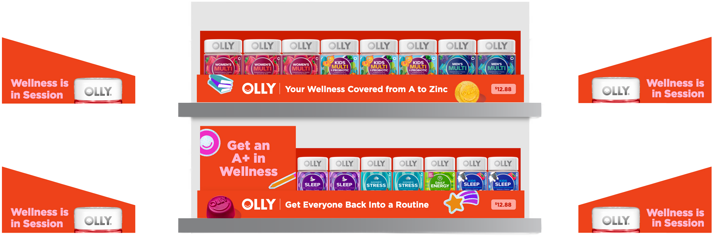
Back to School
2025 Back to School PDQs in Walmart. These two shelves repeated for a total of four shelves; designs to either side of the PDQs indicate side-of-tray graphics. Leveraging both out-of-pack gummies and retro stickers for childhood nostalgia and delight.
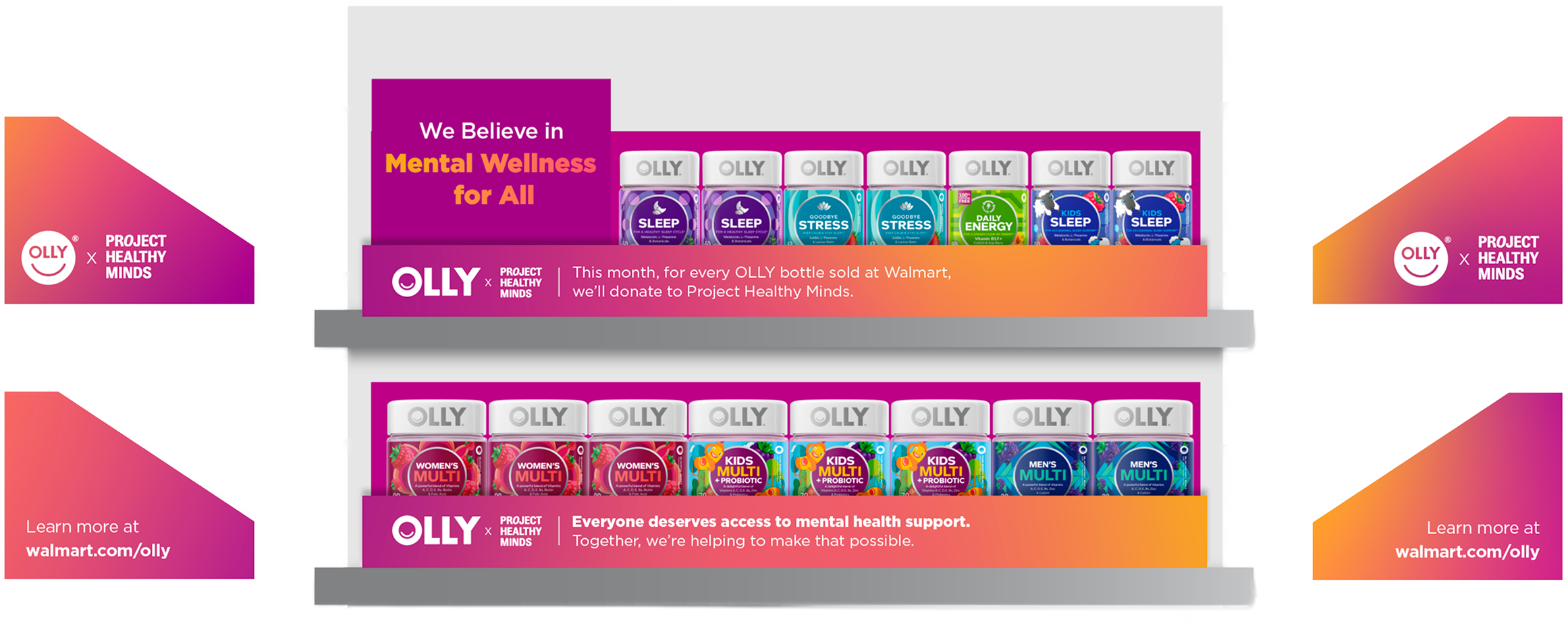
Mental Health Awareness Month
2025 Mental Health Awareness Month PDQs in Walmart. Every May, OLLY partners with nonprofits to support mental health. Using a bolder version of evergreen OLLY colorways, the PDQ highlights OLLY’s mission and provides a CTA to learn more.
Merch
Merchandising for OLLY.com and other partnerships. These atypical projects were ones I was eager to lend a hand on—more of side quests with less structure than a typical brief.
Golden State Valkyries
OLLY is the official wellness partner of the Golden State Valkyries, San Francisco’s WNBA team. As a result of our partnership, we have been able to create activations around Valkyries games to reach a broader audience.
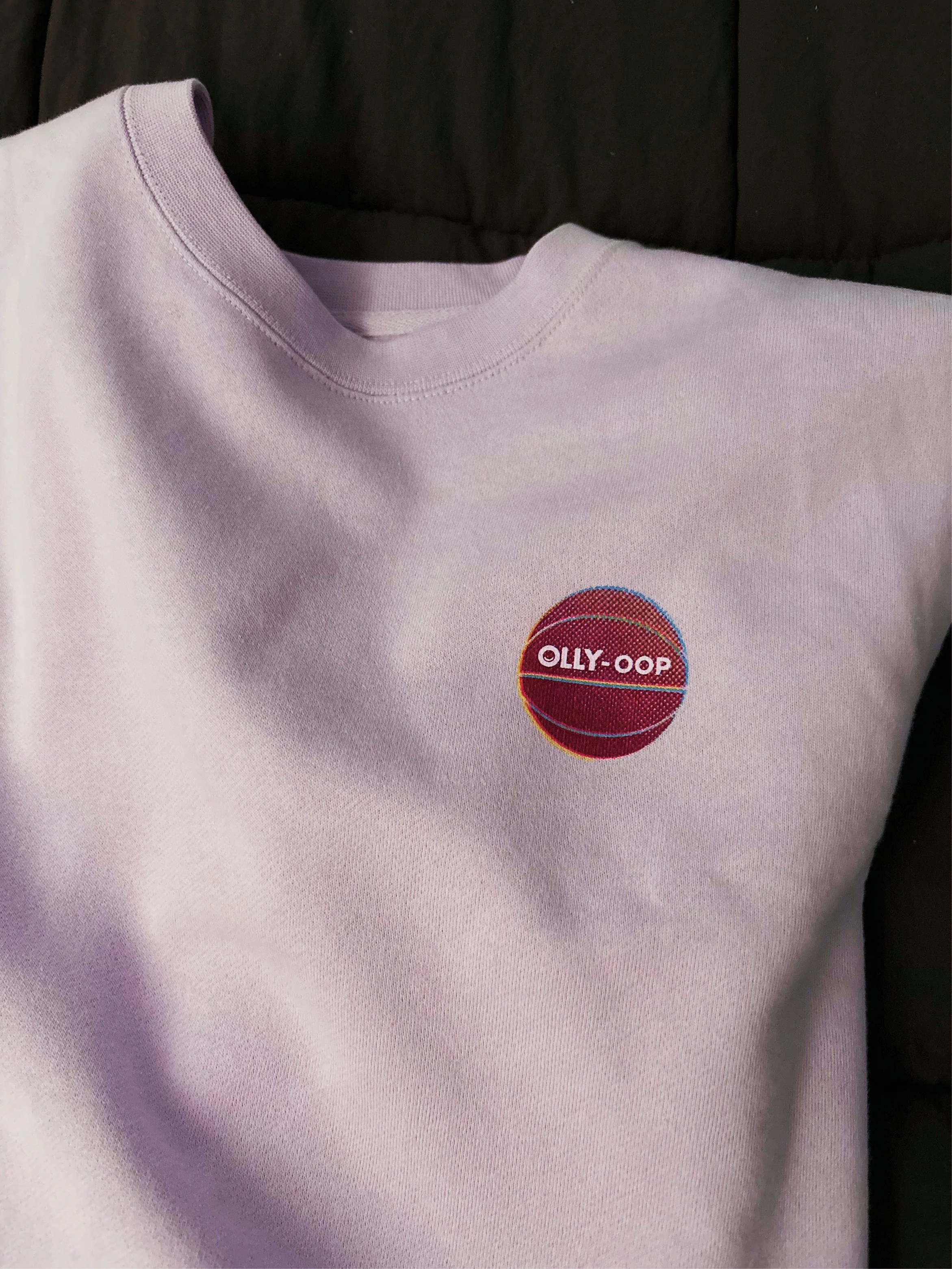
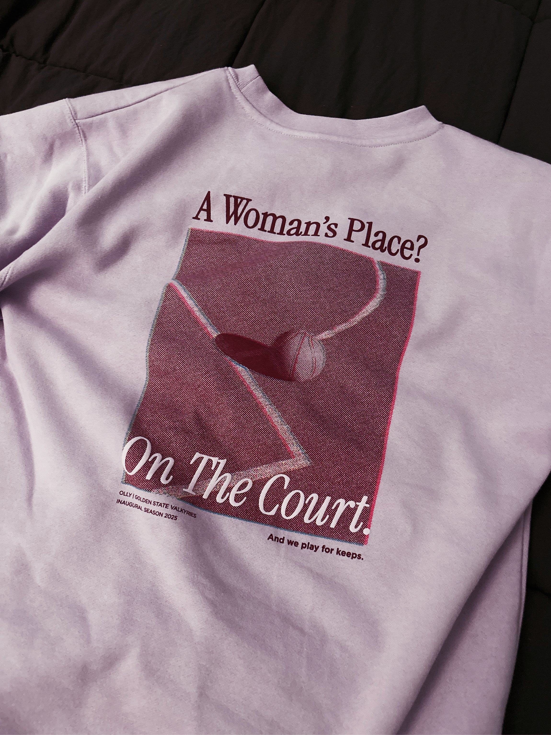
Front and back of sweatshirt for OLLY’s inaugural Back to School night at the Valkyries’. Used half tone to create a retro screen printed look.
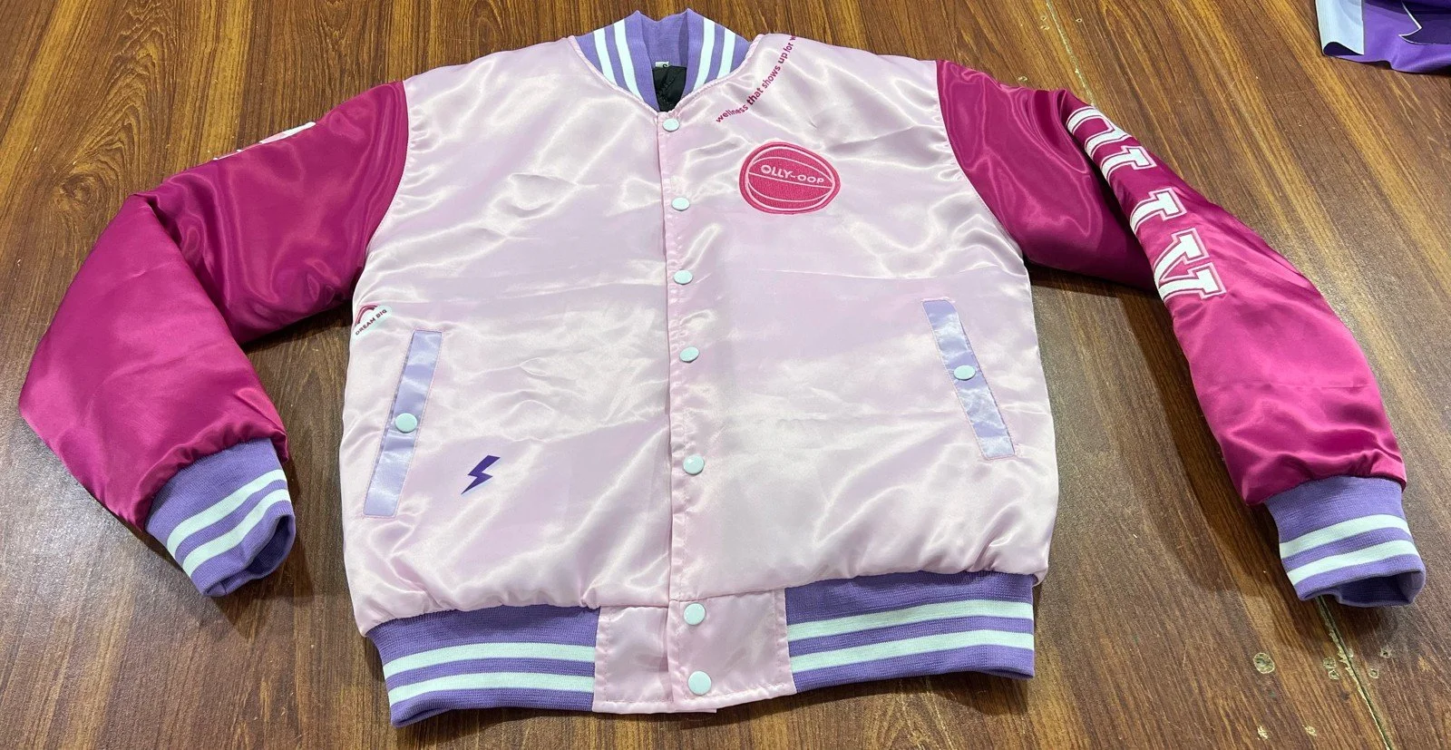
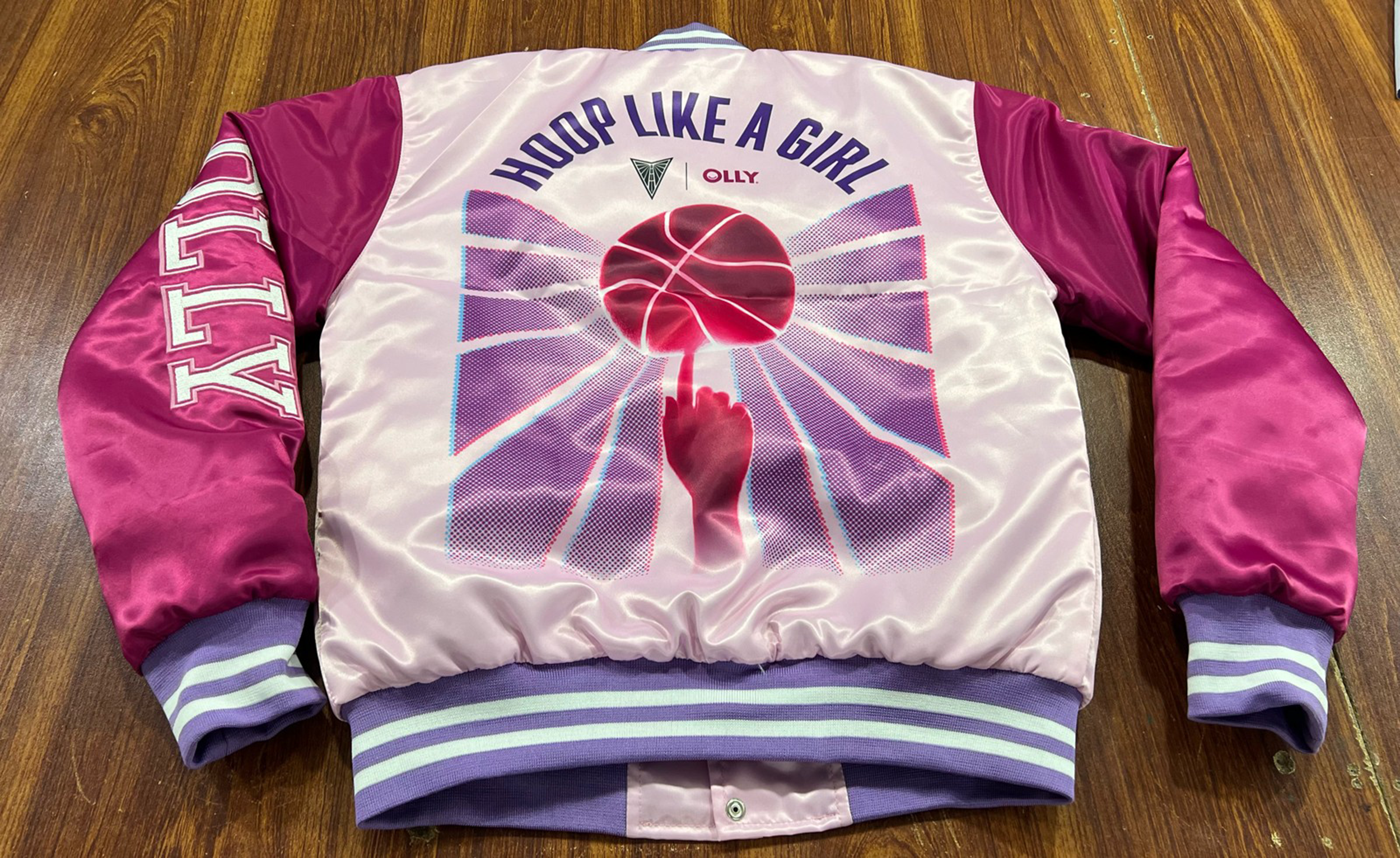
Front and back of varsity jacket for OLLY’s start of season out of home activation. Continued use of half tone to tie in with previous year’s sweatshirt design, while leveraging both OLLY magenta and Valkyries lavender. The rays extending out from the ball are extensions of the wings in the Valkyries’ logo.
The original back-of-jacket design was simply a lockup of the two logos, but I pitched and executed this more impactful design that would stand out from far away and feel more graphic.

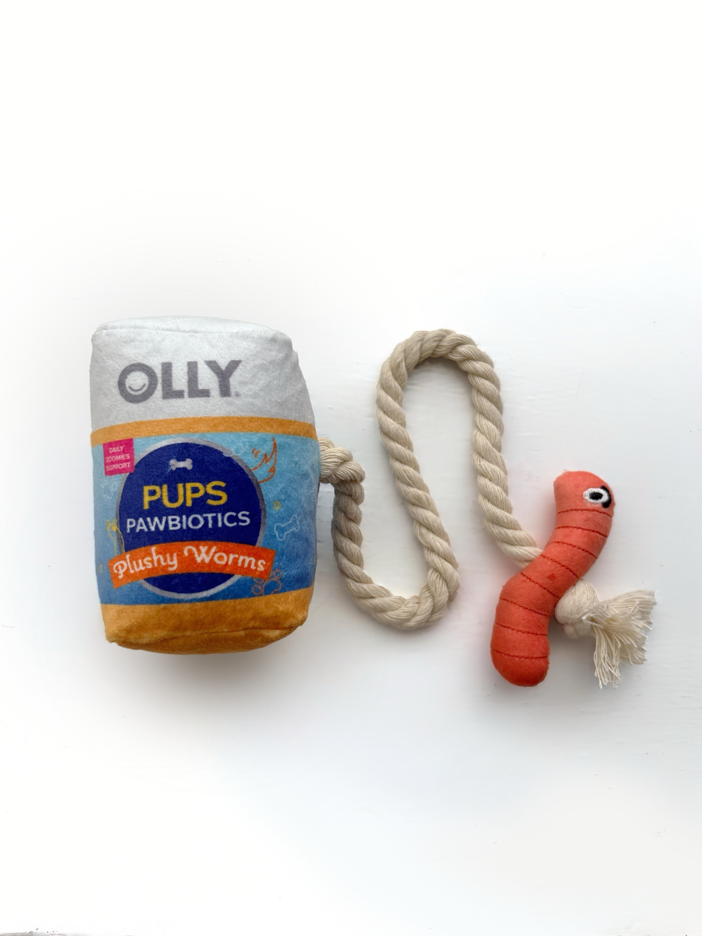
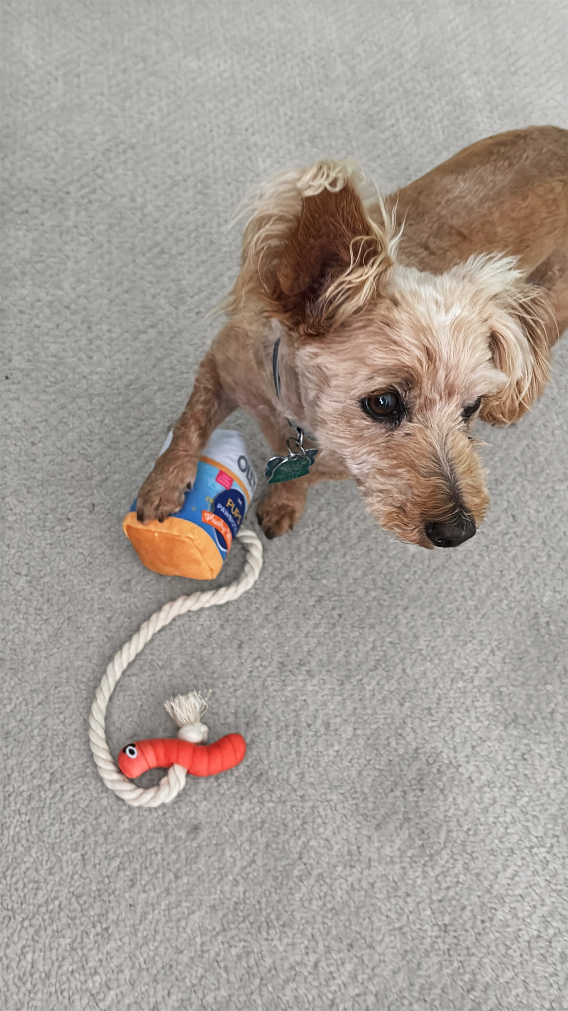
OLLY.com Rewards
Through OLLY’s reward page, consumers can use points to purchase extra swag. One of these items is a dog toy—I designed the “bottle,” based on our Kids Multi Gummy Worms bottle.
Bonus
Another tool in the kit—Photoshop composites and retouching.
Hover on images to see original product assortment.
Photoshop
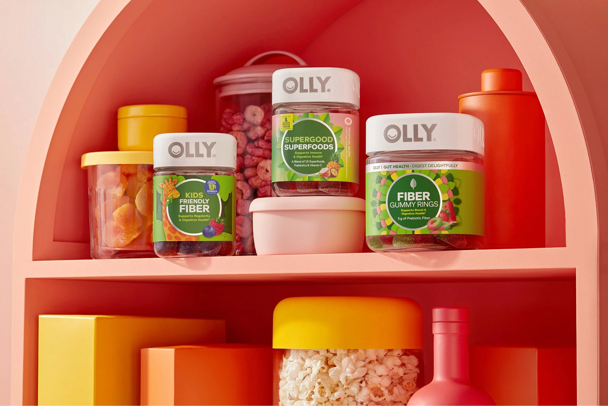
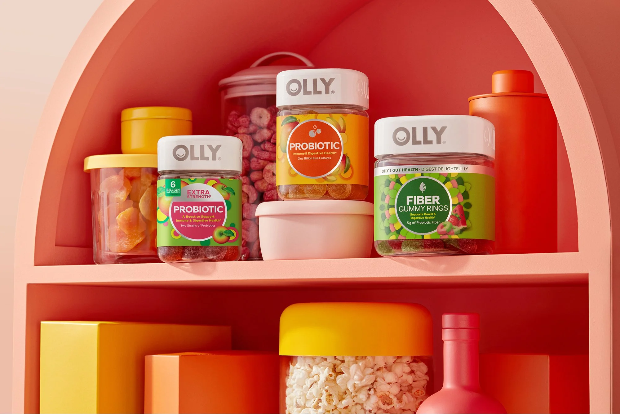
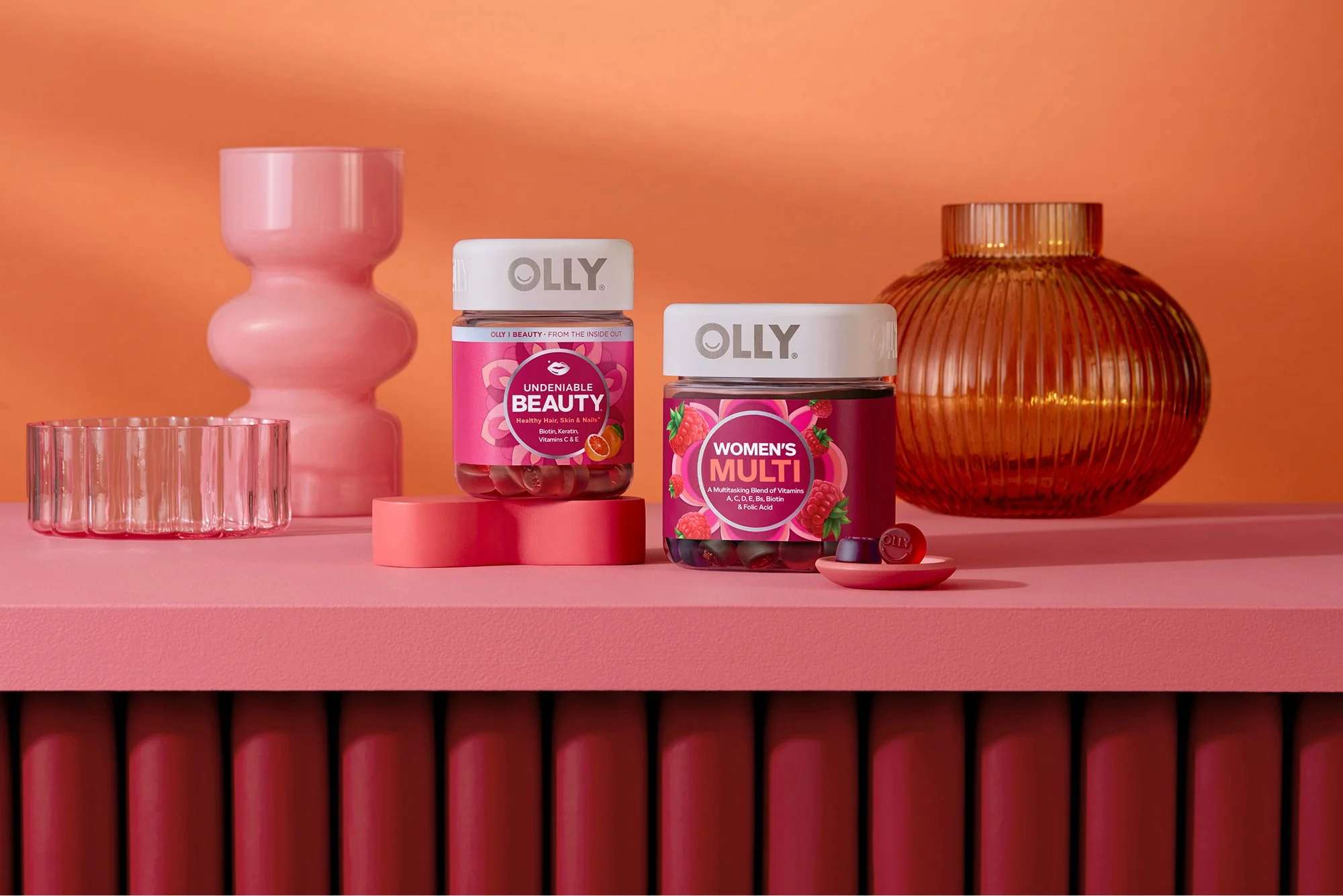
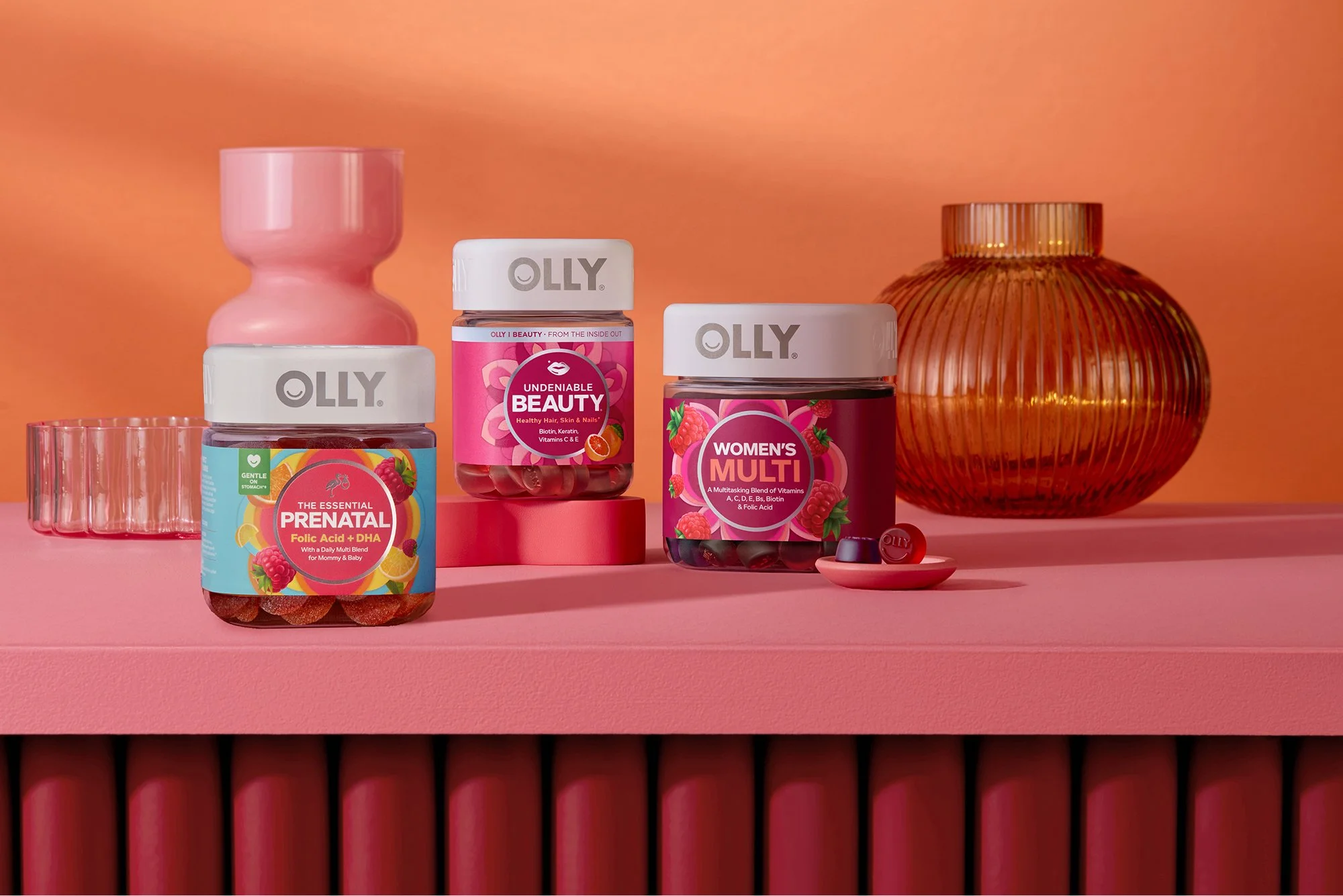
Since it’s impossible to photograph every product assortment, we often need to swap out one or two products in a shot to meet stakeholder requests. This includes taking a product from a different photo and matching the lighting or using the flat label to swap out.
You may also enjoy…