Titan
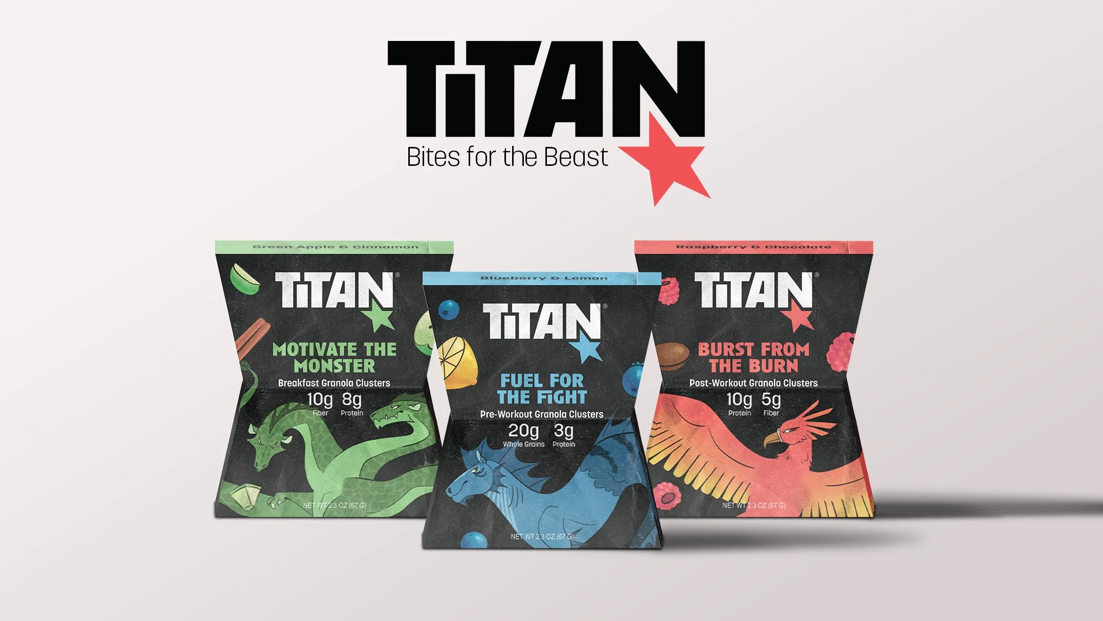
Titan is a high-fiber, high-protein granola made for athletes. Each SKU is catered to different workout-centric occasions.
I collaborated with an industrial designer (packaging form, dielines, monster illustrations) and another graphic designer (logo, colors, copy). My primary role was the design on pack, flavor illustrations, and final renders. We worked together on every step of the process for insight, inspiration, and feedback.
Scope
Packaging
Brand Systems
Software
Adobe Illustrator
Adobe Photoshop
Brand System
⊛
CPG Packaging
⊛
Illustrations
⊛
Product Renders
⊛
Brand System ⊛ CPG Packaging ⊛ Illustrations ⊛ Product Renders ⊛
The Background
What is the goal of this brand and product?
How can we ensure that the product meets market demand and stands out from existing products?
Project Objectives
Design three different SKUs for a novel granola brand that stands out in market.
Design a sustainable packaging solution that is unique & memorable.
Consider nutrition, dietary needs, convenience, & relevance to our audience.
Process
Research Summary
Looked at major local retailers in-store such as Target, Walmart, Wegmans, etc.
Narrowed our audience to include Gen Z endurance athletes in late high school to early college. This audience is an untapped market in granola.
Took note of trends (earthy colors, boxes and plastic bags) and whitespace (most existing brands target hikers or everyday people) based on our audit and Mintel reports.
Surveyed RIT Gen Z endurance athletes to discover they value nutrition, portability, aesthetics, cost, and sustainability.
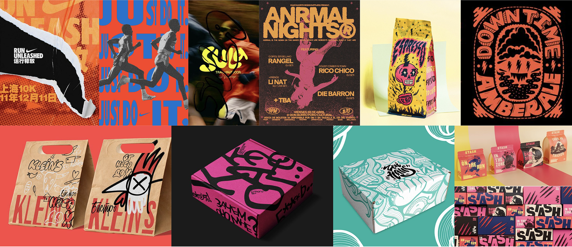
Mood board based on what would stand out on shelf in the existing sea of brown and green. Bold, bright colors; macro graphics; hand-drawn imagery and textures.
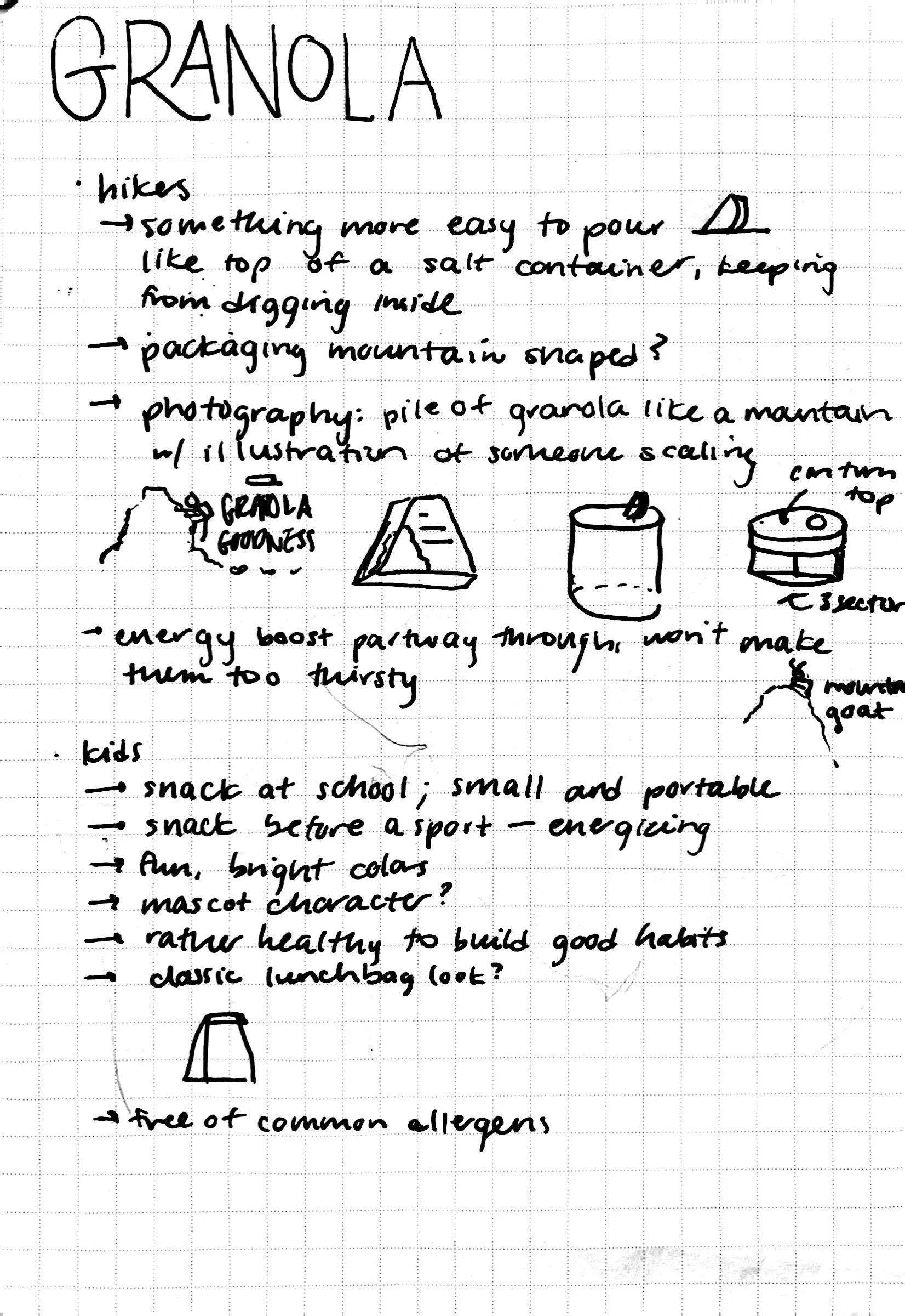
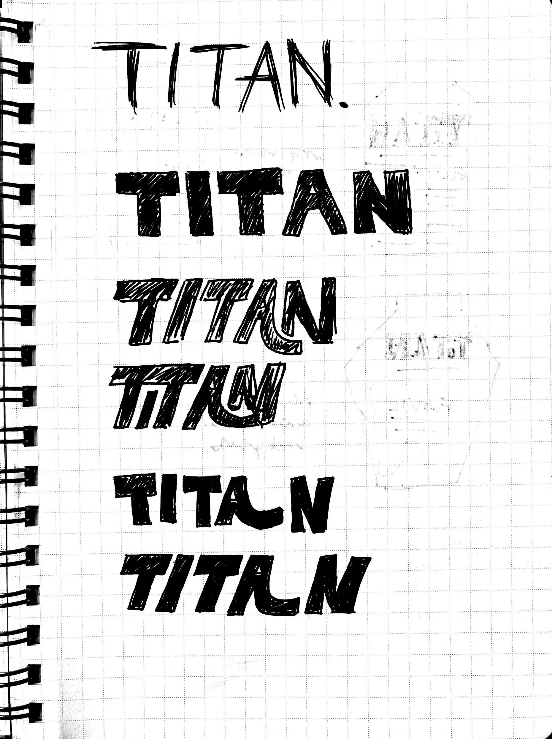
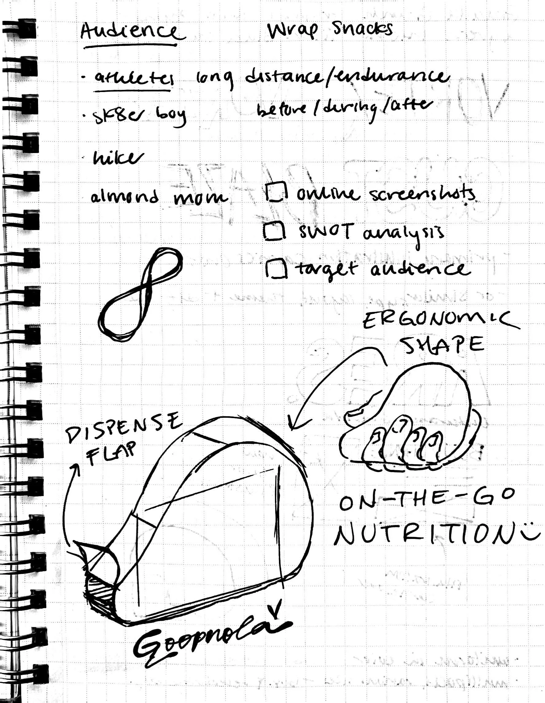
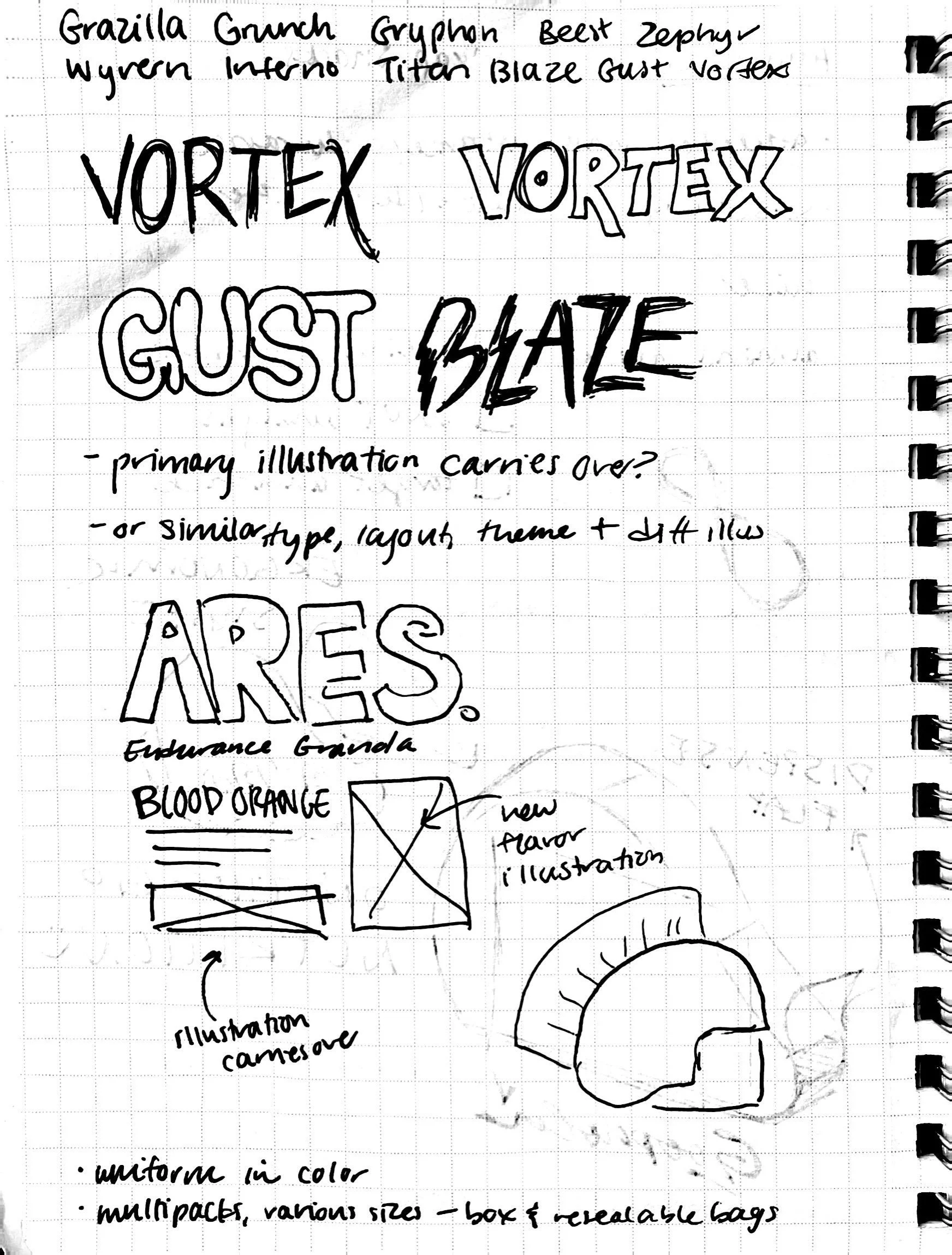
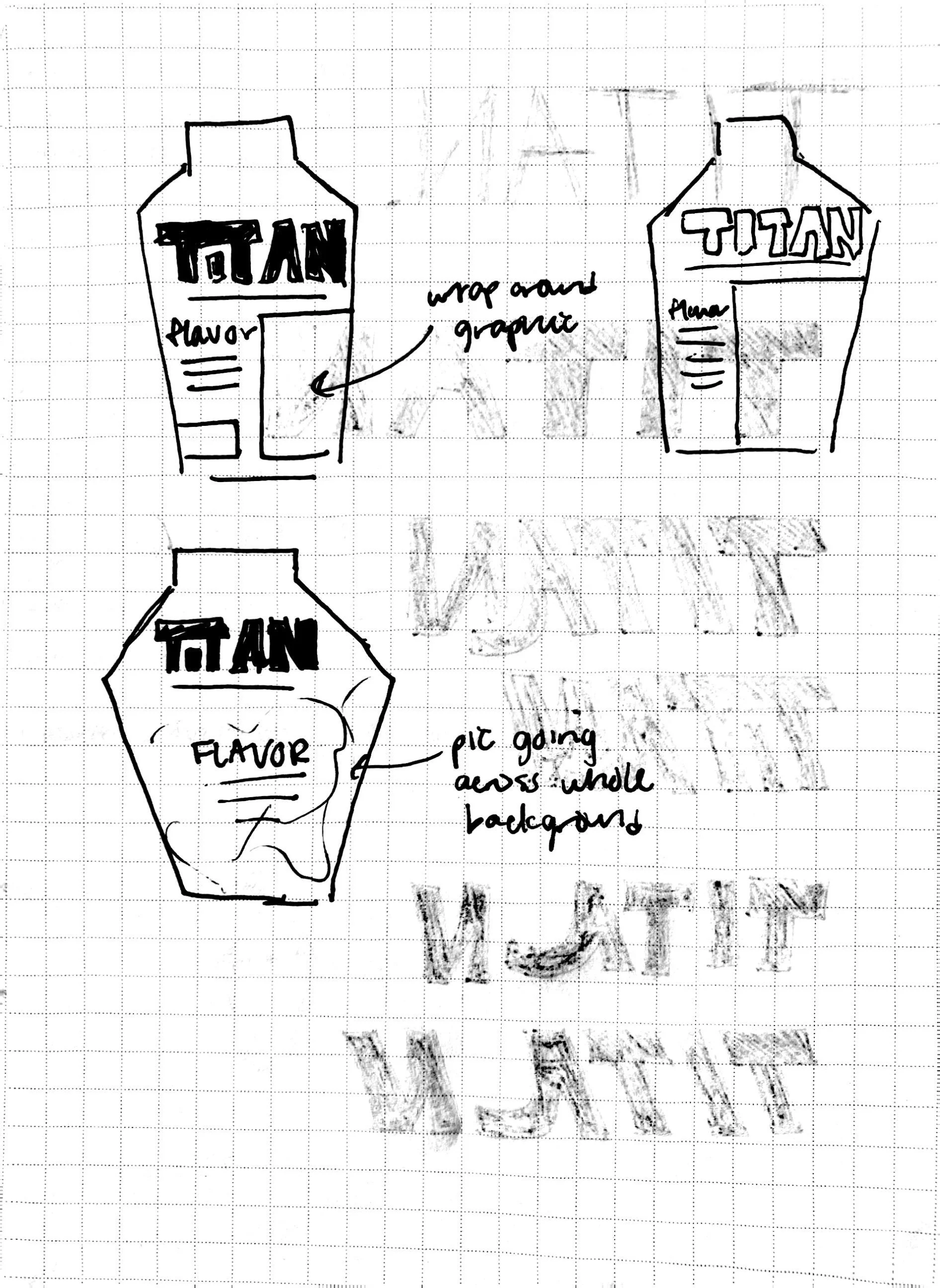
Sketches throughout the process—ideation on concept as well as logo and packaging layout sketches.
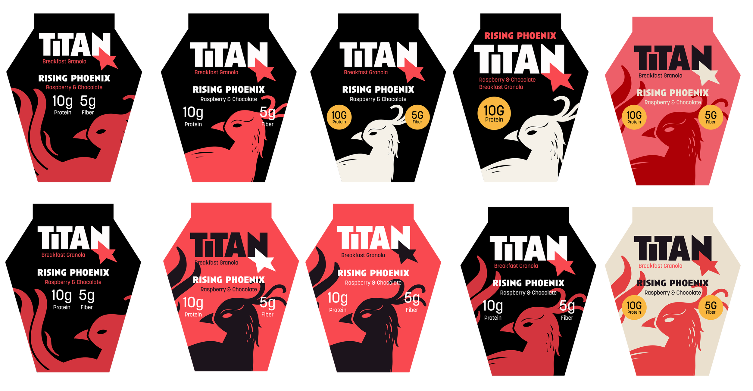
Digital ideation for packaging layout (with a previous packaging shape idea).
Challenges
We faced several challenges while designing for this project. We spent a long time struggling with the brand name as many that fit our audience were already taken.
Our primary struggle, however, was with the packaging shape. None of us are packaging scientists; therefore we had many ideas for a single-serve package that fit in the hand that were very difficult to produce.
Other shapes (like those above) resembled coffins more than the Grecian vases they were meant to. We did away with the idea of curved forms altogether and found a packaging shape that could be produced on the line and still fit well with our audience.
I was tasked with the final execution of the prototype—cutting and building the package—and learned a ton about packaging forms and best practices in the process.
The Solution
How Titan shows up in the real world.
Final disruptive branding and innovative packaging.
Branding
Logo, Type, and Colors
Knocked out logo with the tagline, “Bites for the Beast.”


Pure black version of the logo.

Packaging
Materials
SBS Paperboard (coated both sides)
This is sturdy, sustainable, easy for customers to deal with at end of life.
Papkot Coated Paper
This is 99.9% recyclable and biodegradable. No plastic or fluorine and food safe.
Sketches & Prototypes
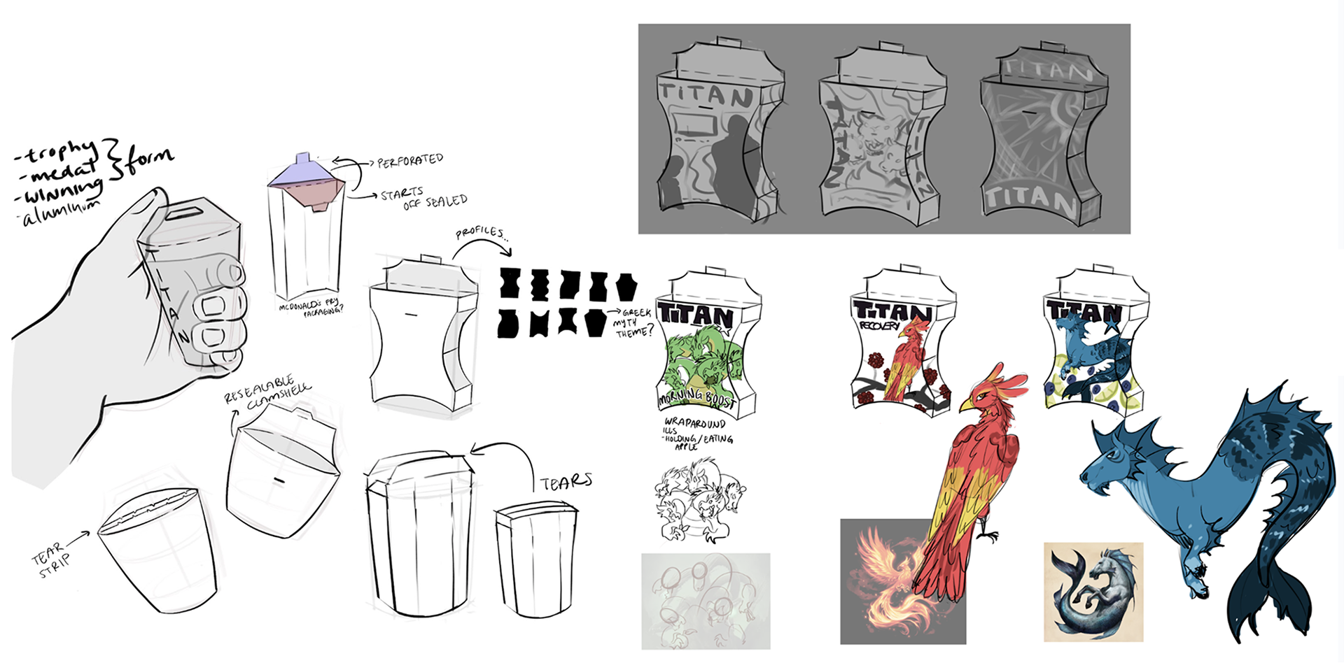
Sketches by Charlie John-Melendez exploring different shapes that conform to a natural grip, plus character illustrations.
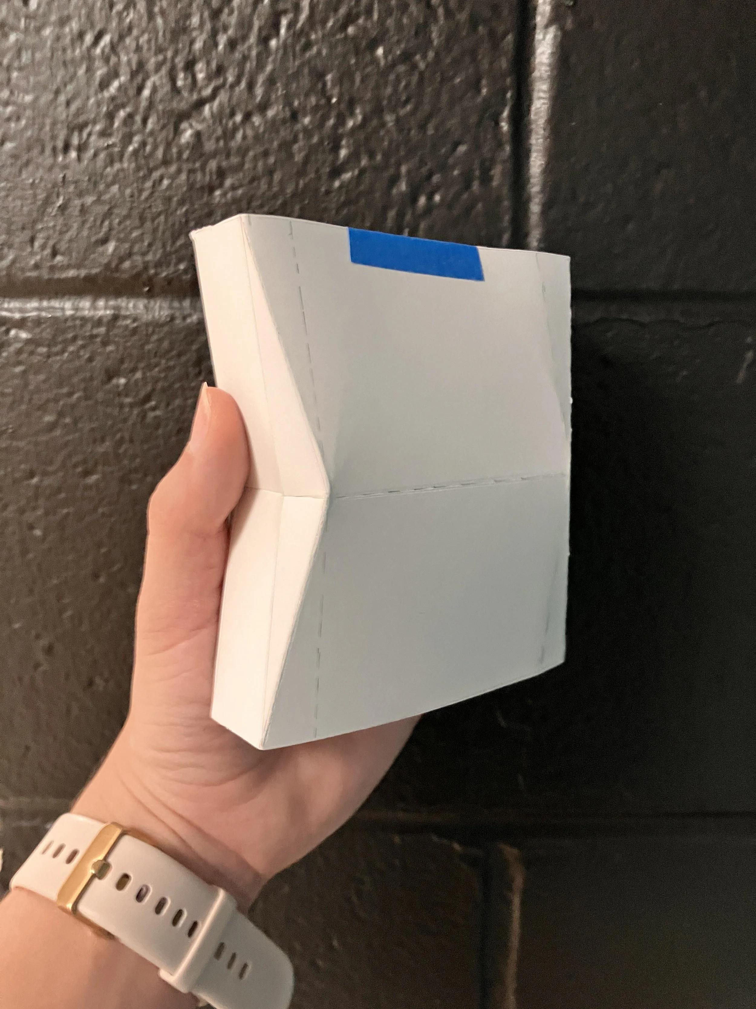
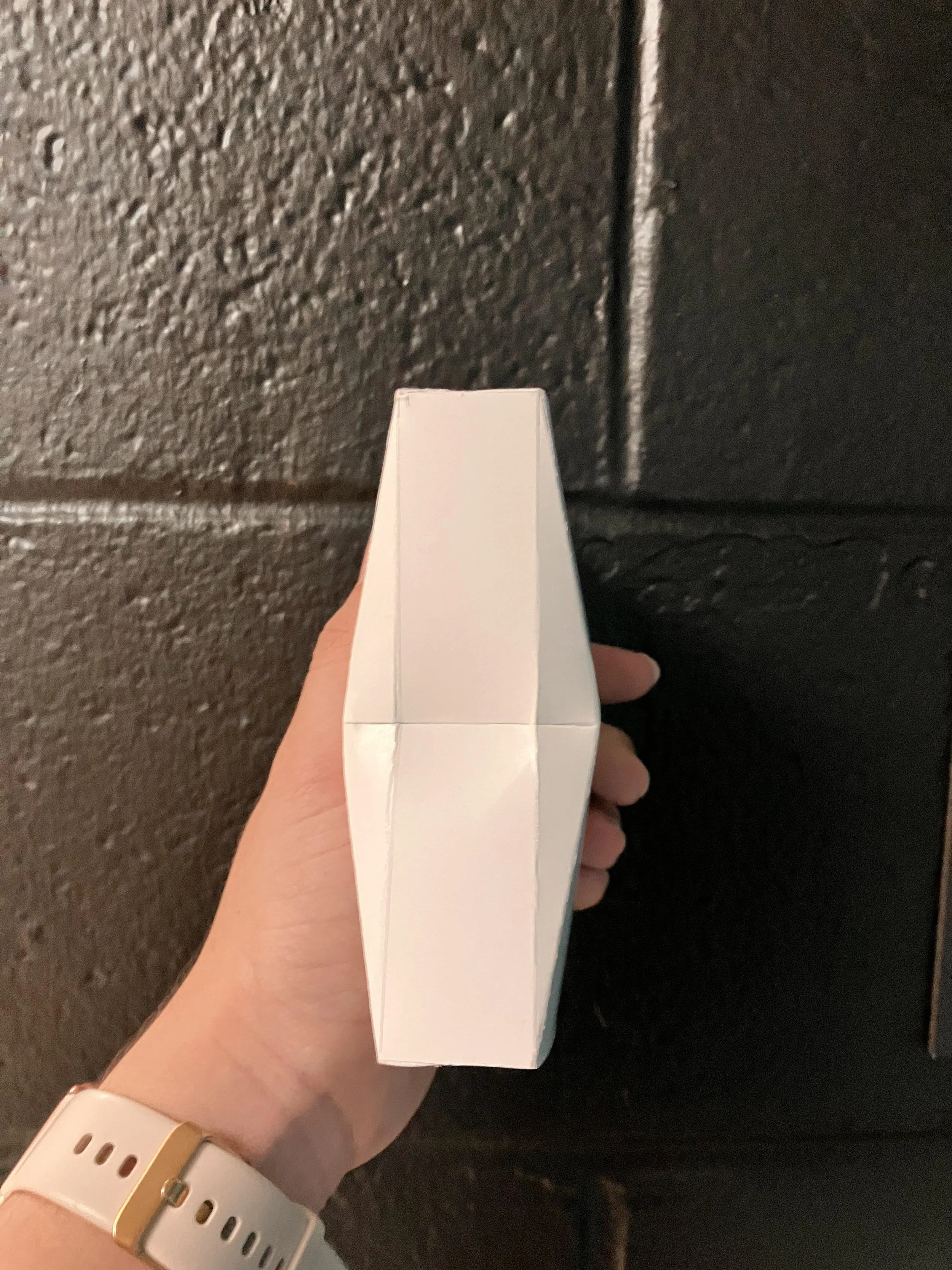
Paper prototype of packaging. Left: three-quarters view. Right: side view.
Paper prototype of packaging. Top: three-quarters view. Bottom: side view.
Final Renders & Dielines
SKU #1: Motivate the Monster
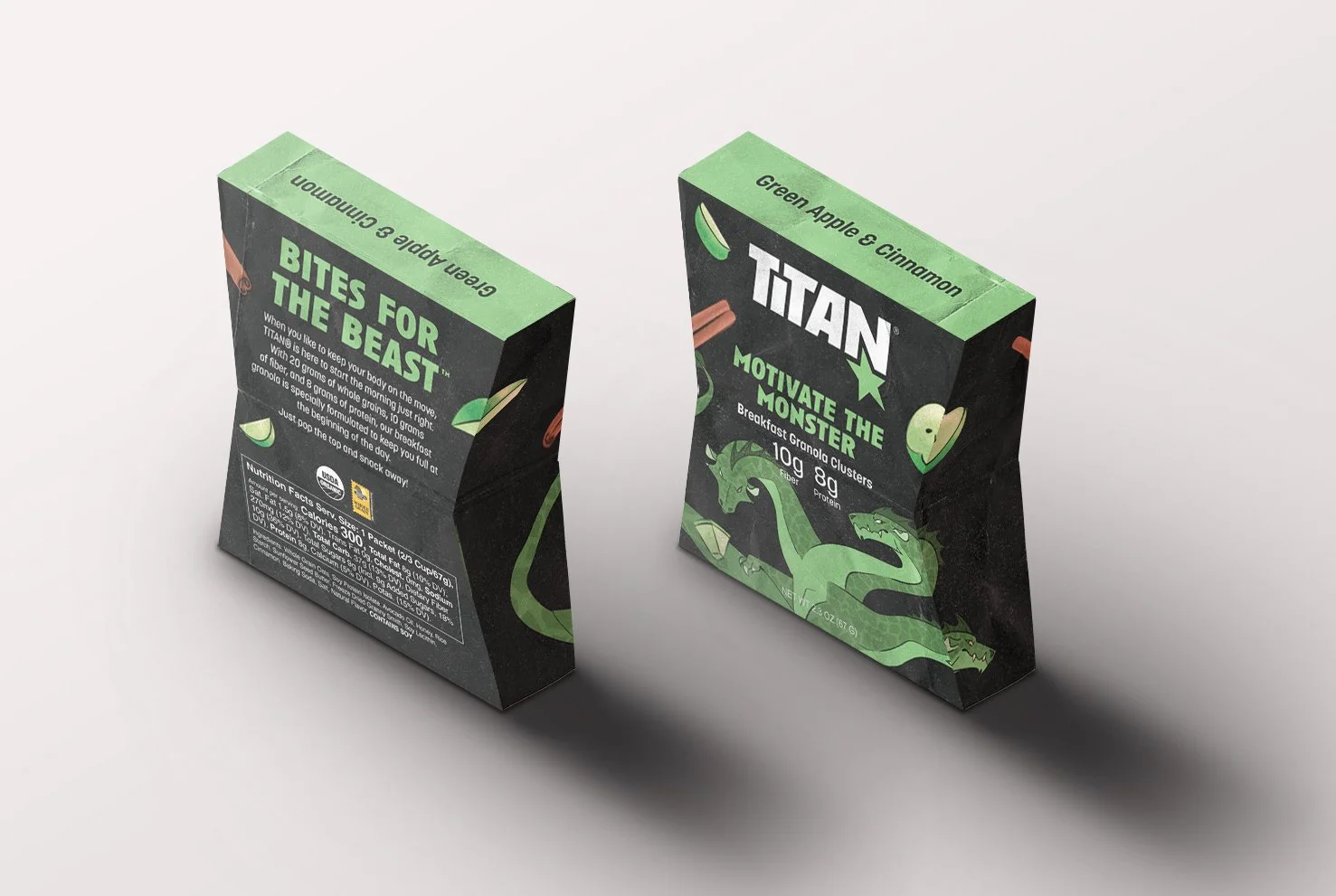
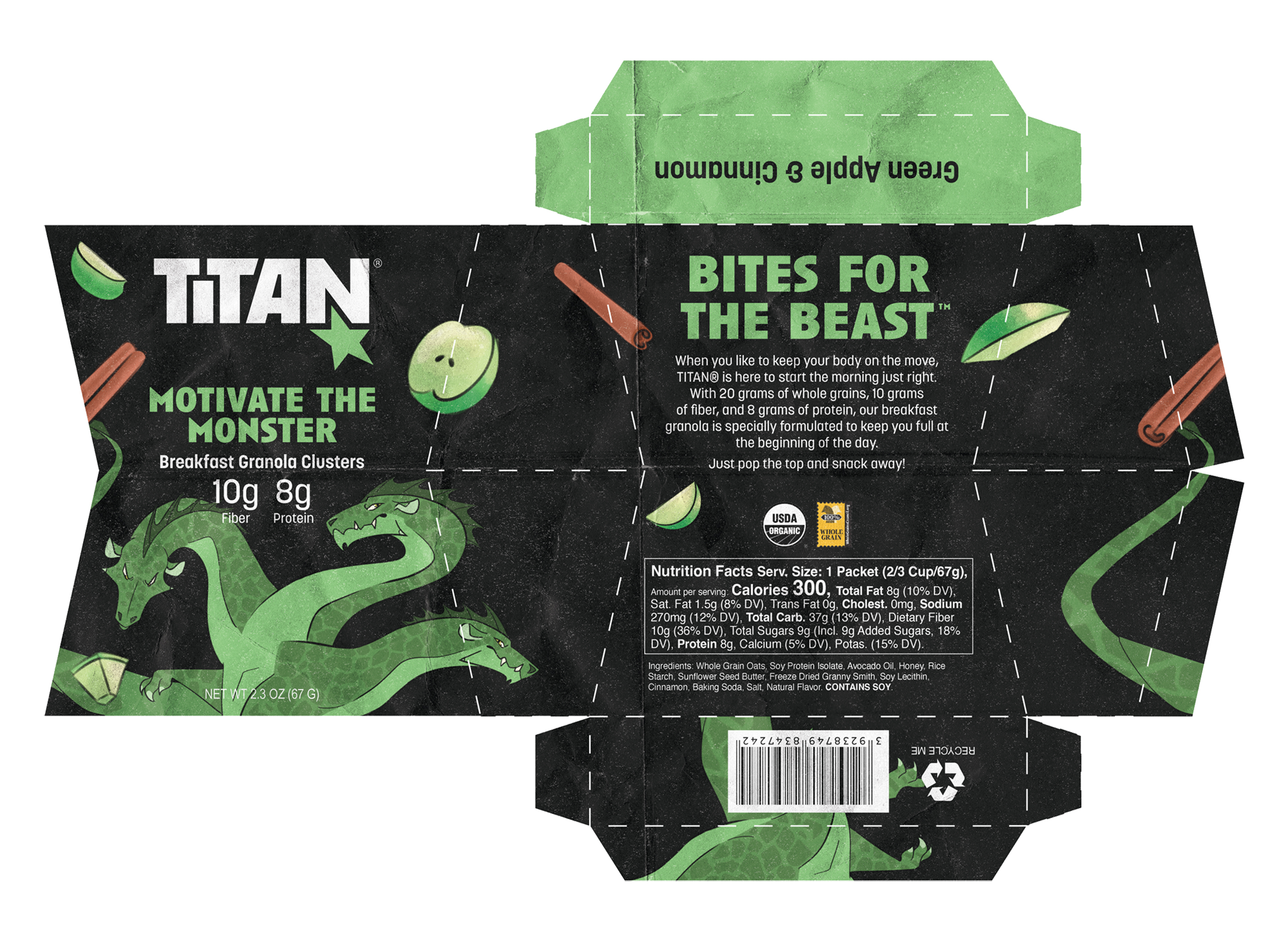
Beast: Hydra. A multi-headed monster. Cut one head off and two grow in its place—the hydra is hard to beat.
Flavor: Green Apple and Cinnamon
Occasion: Breakfast. With extra fiber and a moderate amount of protein, Motivate the Monster keeps you full at the beginning of the day.
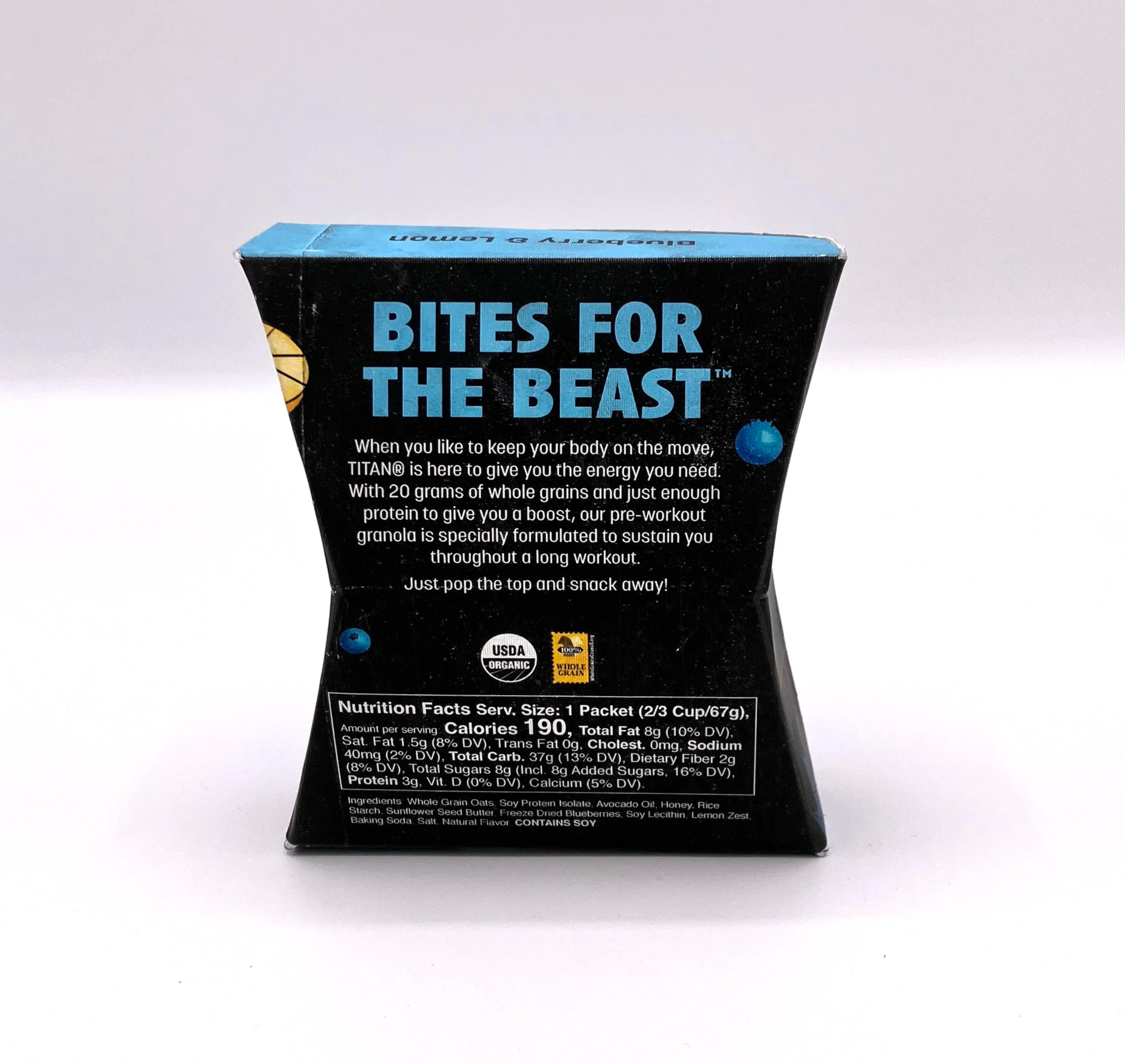
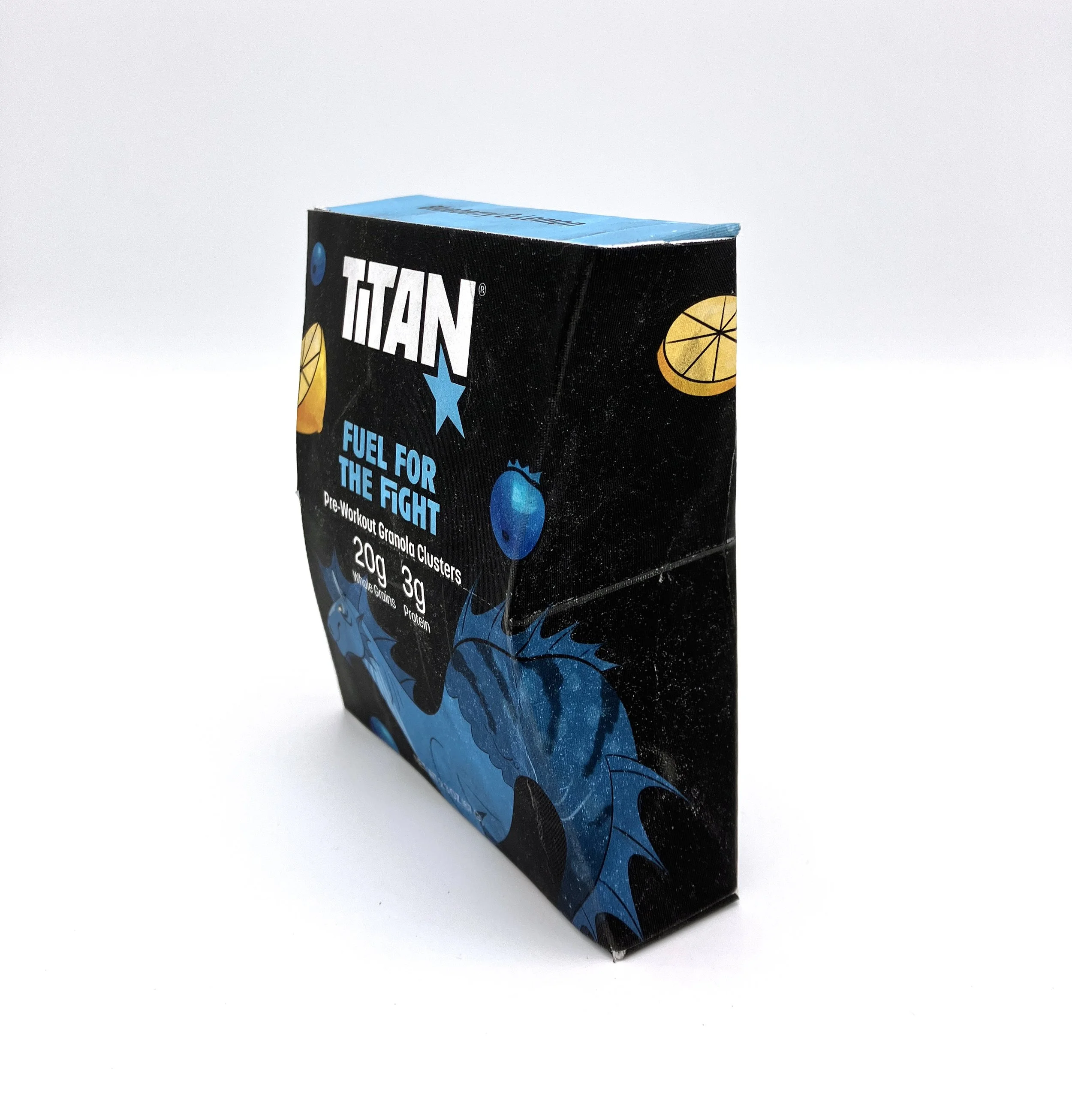
SKU #2: Fuel for the Fight
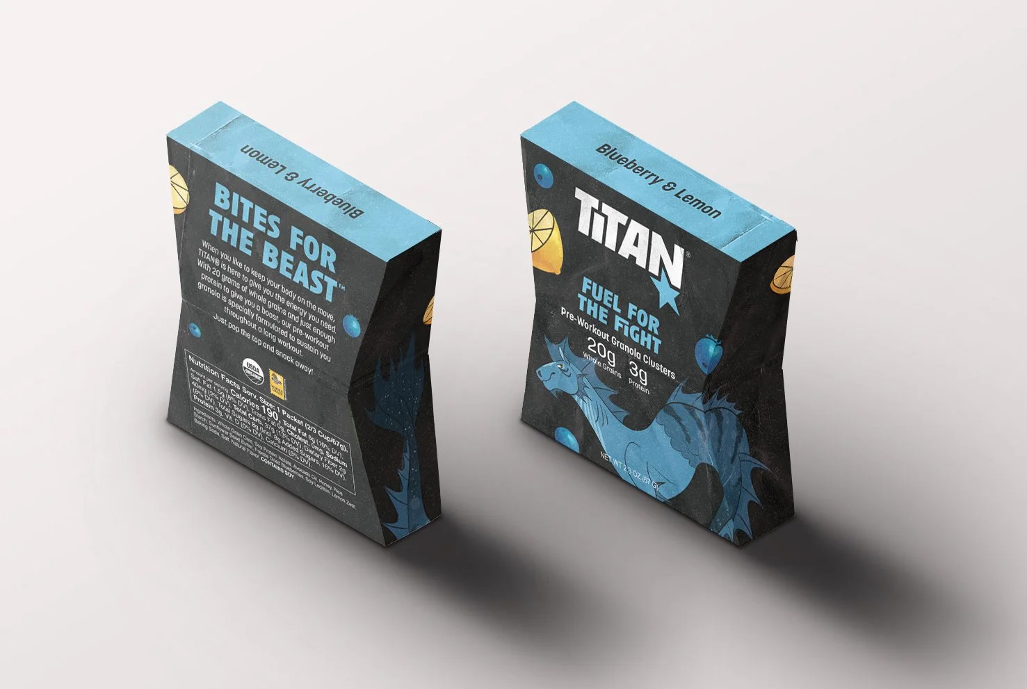
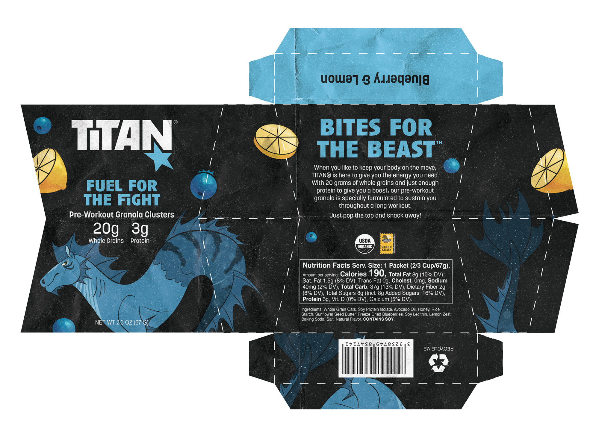
Beast: Hippocamp. This swift horse lives in the water—a literal sea horse.
Flavor: Blueberry and Lemon
Occasion: Pre-workout. With lots of whole grains and a small amount of protein, Fuel for the Fight provides enough nutrients to give you a boost and sustain a long workout without weighing you down.
SKU #3: Burst From the Burn
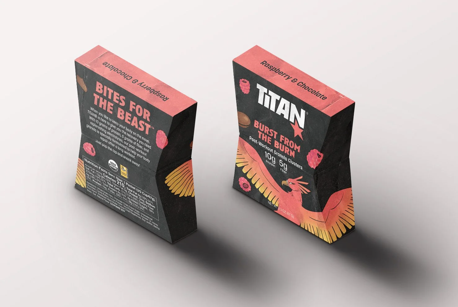
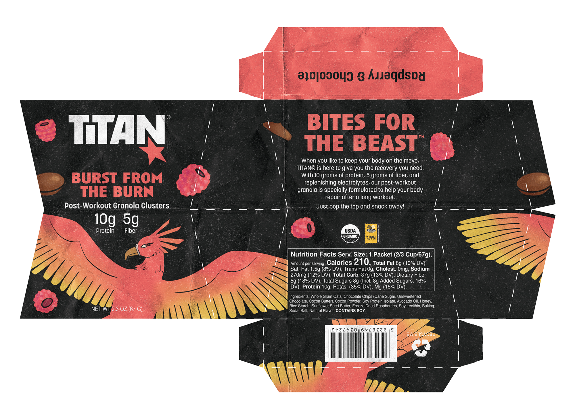
Beast: Phoenix. An immortal bird that is reborn as it rises from the ashes of its predecessor.
Flavor: Raspberry and Chocolate
Occasion: Post-workout. With high protein, fiber, and electrolytes, Burst From the Burn replenishes your body and helps it repair after a long workout.
Final Packaging Prototype
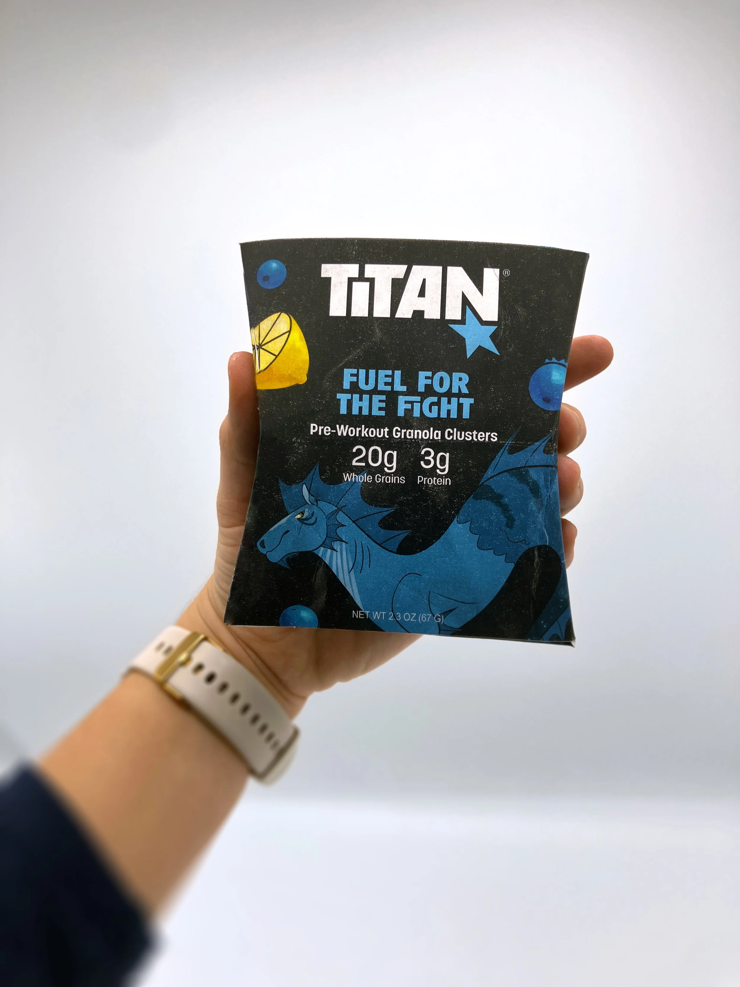
Printed on sticker paper and mounted on SBS paperboard, coated both sides.
You may also enjoy…